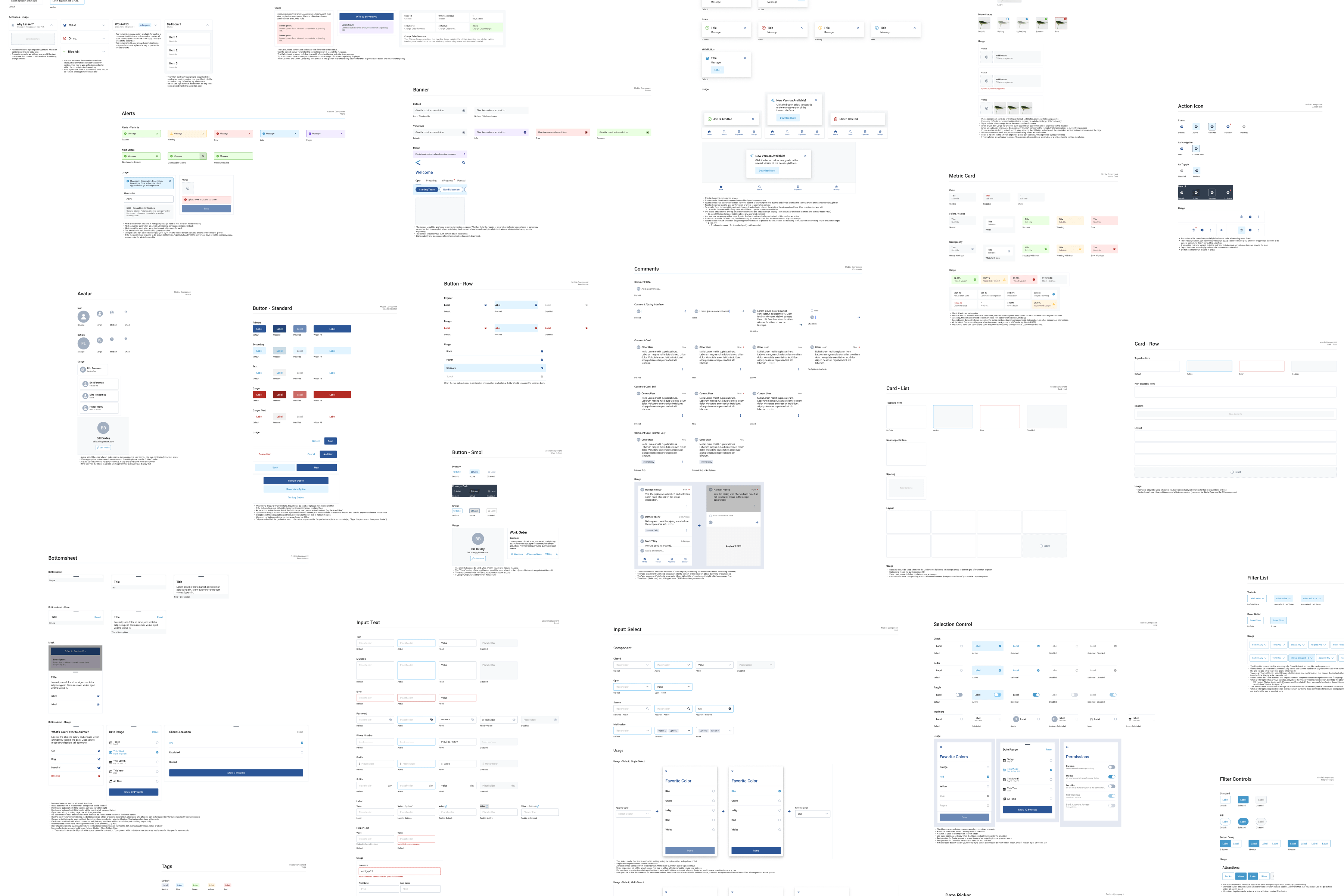
About the project
The StrongMind App is an iOS and Android application for StrongMind, an EdTech company supporting charter schools across the country. I had been leading the app since February, and the next major feature was a Student Overview, giving students and parents meaningful insight into academic progress directly on their phones.

Data-rich, but approachable
This was a much more data-rich and information-dense feature than anything the app had included before, with new patterns and new complexity. The Student Overview had to satisfy a strict set of constraints:
- Simple enough for a 6th grader to understand
- Actionable information based on real business requirements
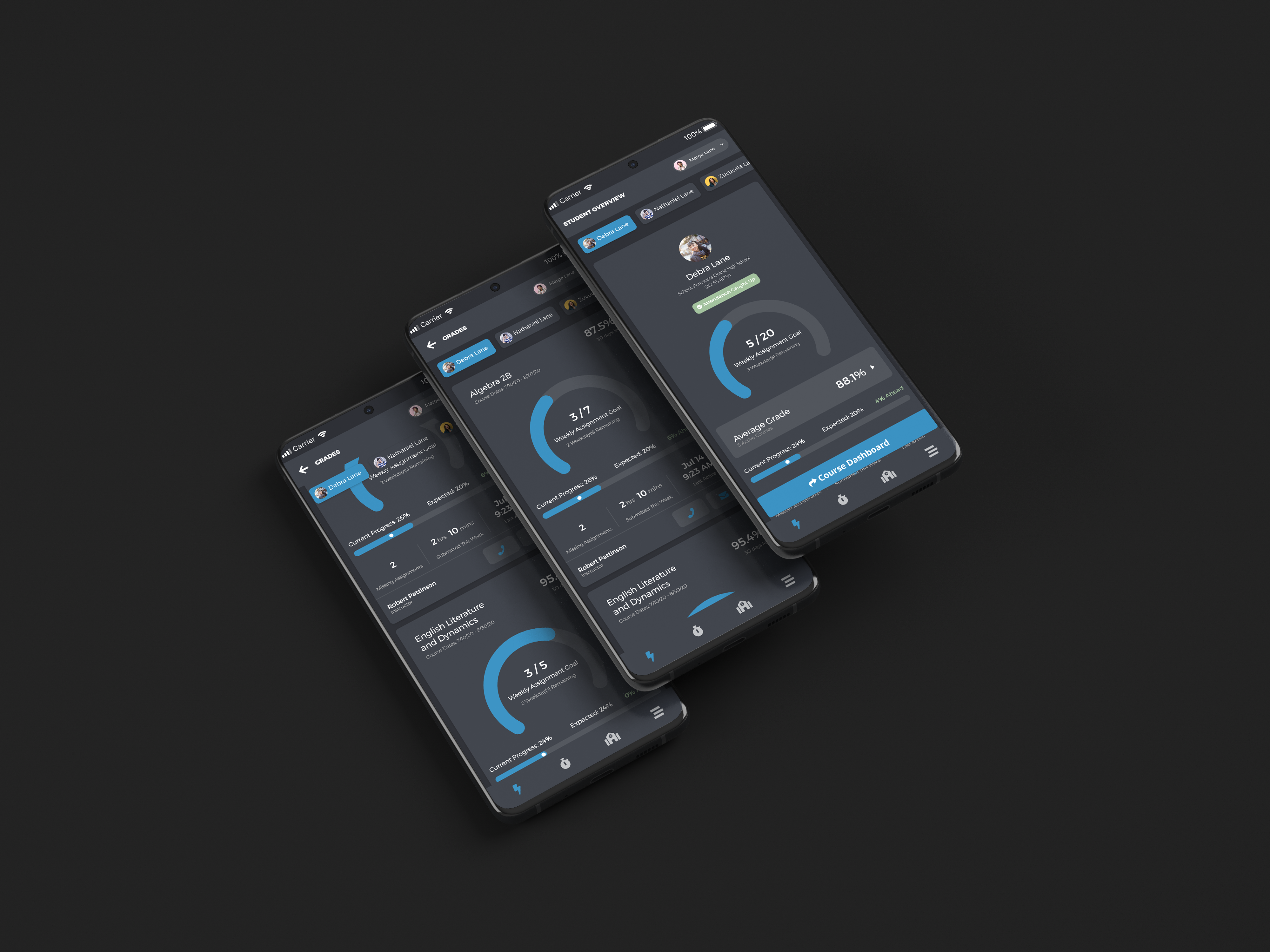
- Include a circle graph (direct CEO request)
- Make sense from both a parent and student perspective simultaneously
- Be modular, agnostic enough that each client could use it without certain features
All of this information needed to fit in a hierarchically meaningful way while being approachable, digestible, and concise.
Define, sketch, test
I started by aligning the acceptance criteria with engineering and PM to ensure every data point was feasible and correctly scoped. Then I moved to sketching and wireframing possible combinations of the data, checking existing StrongMind products for patterns I could leverage.
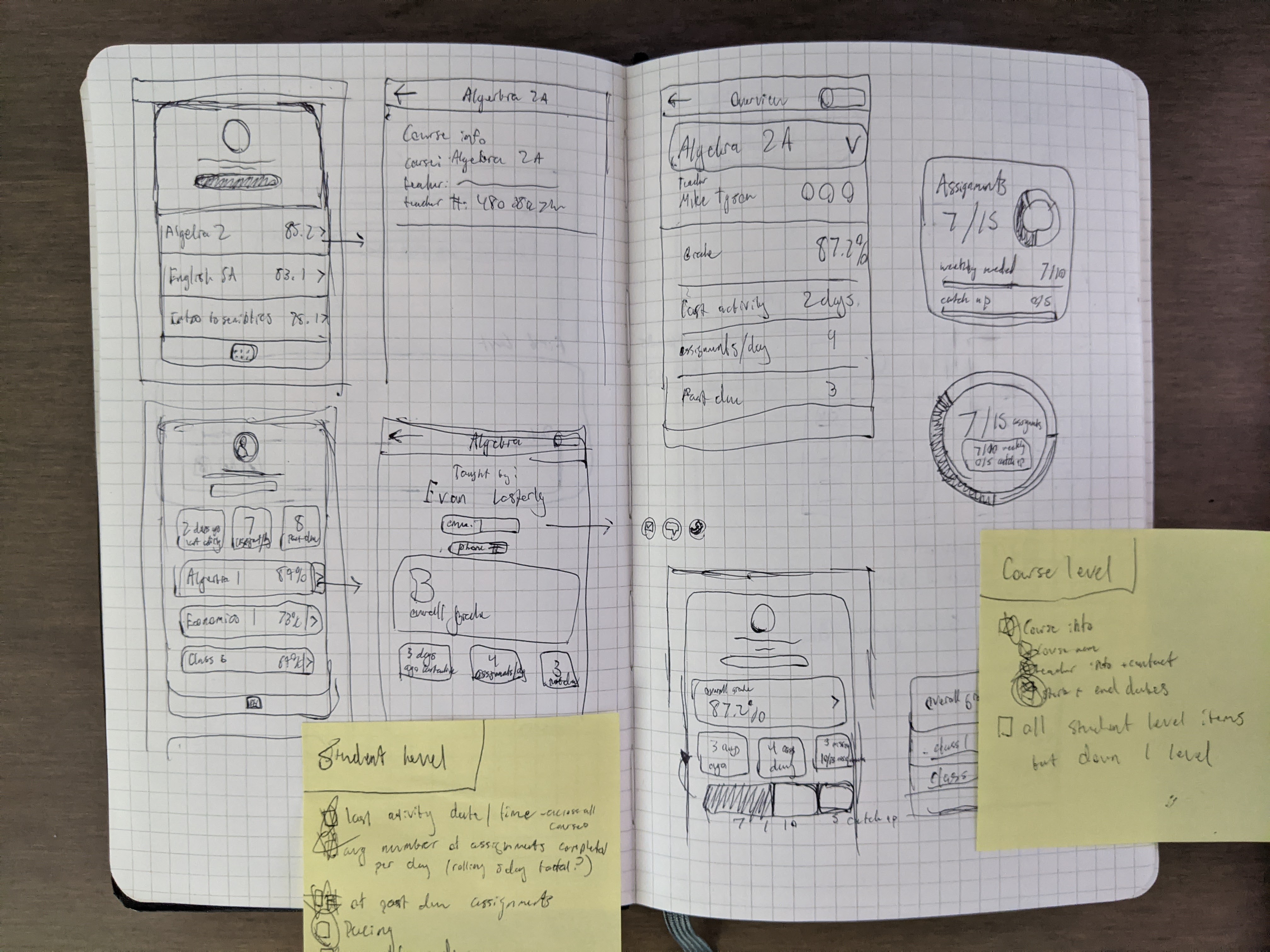
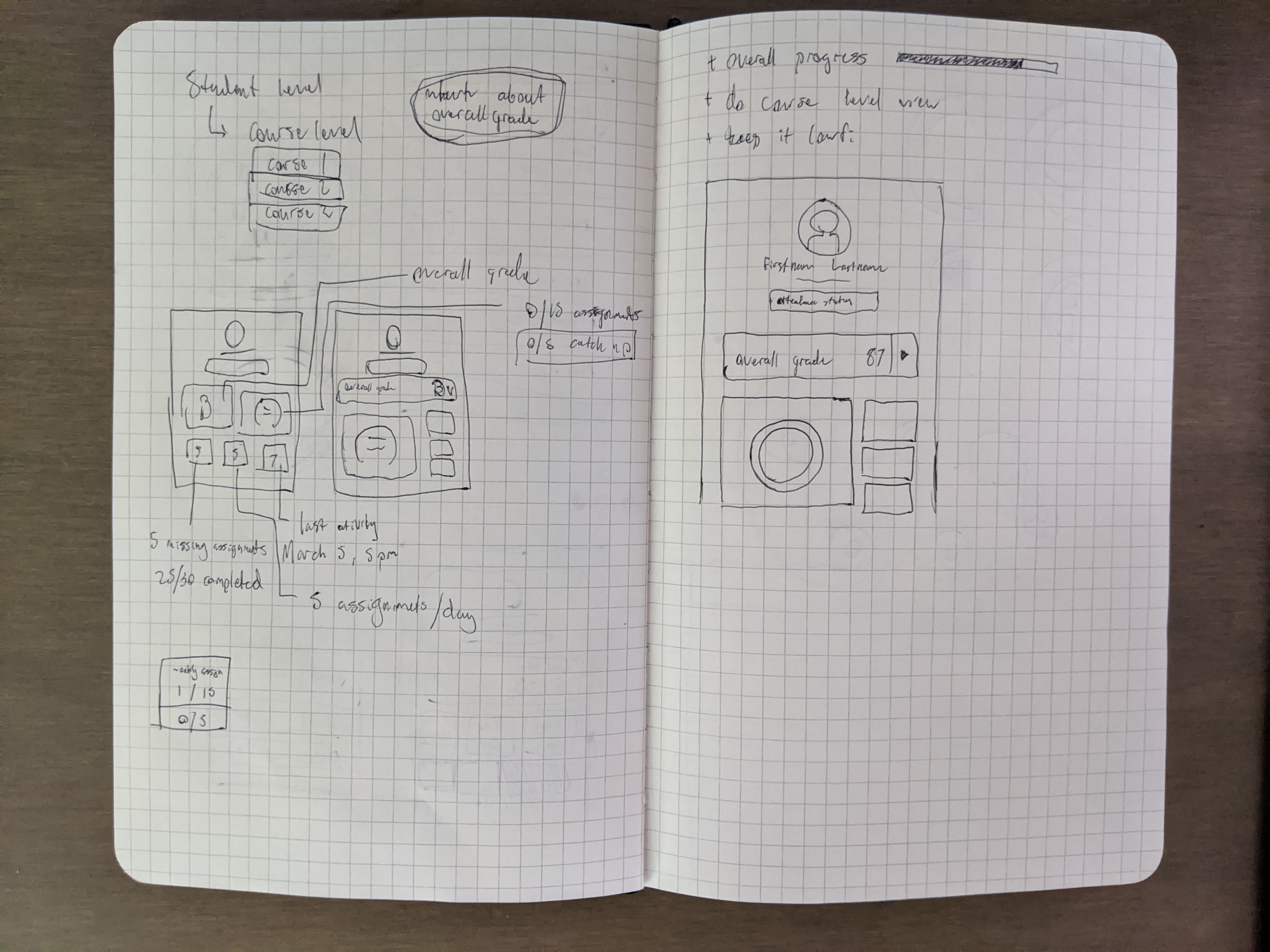
Initial sketches and wireframes
After getting the initial layout established, I moved to wireframes and ran guerilla testing with a coworker who happened to be the parent of a student at one of our client schools, a quick gut check before working with our UX Researcher on a structured round of testing.
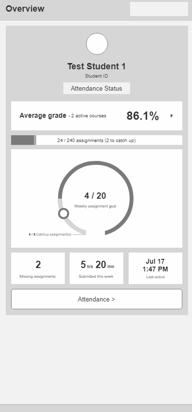
Low-fidelity prototype
Two rounds, real users
Working with our UX Researcher, we ran 8 moderated sessions with 4 students and 4 parents. Key findings from Round 1:
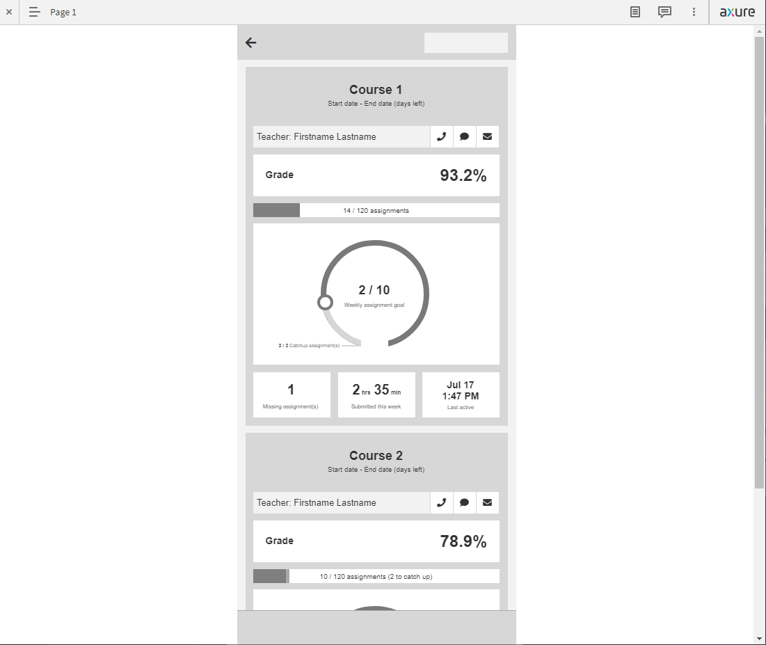
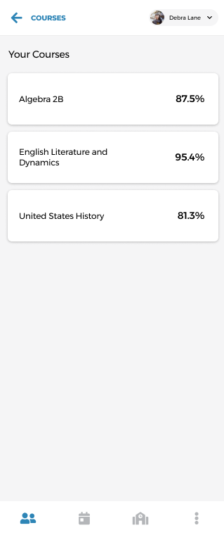
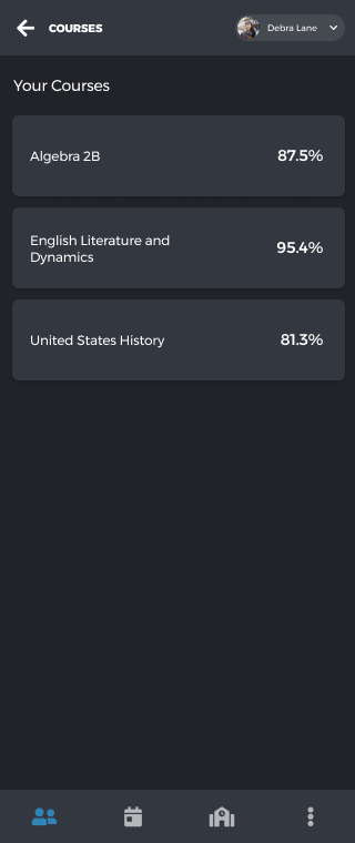
- Users successfully navigated to course-level breakdowns and back
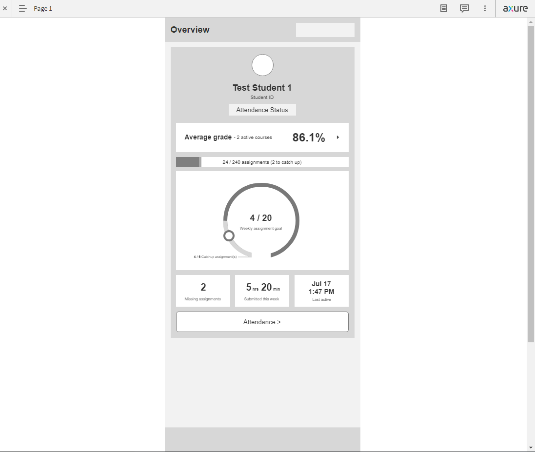
- Missing Assignments and Average Grade rated as most important data points
- Catch-up assignments concept caused consistent confusion; users conflated it with missing assignments
- Weekly assignment goal graphic was poorly understood
- All users would use the app (students claiming daily) to check grades and progress
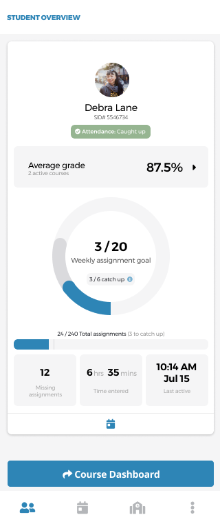
Armed with that feedback, I revised the designs and ran a second round with 7 participants (4 returning). The high-fidelity redesign improved comprehension across the board.
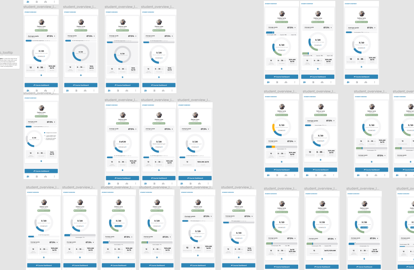
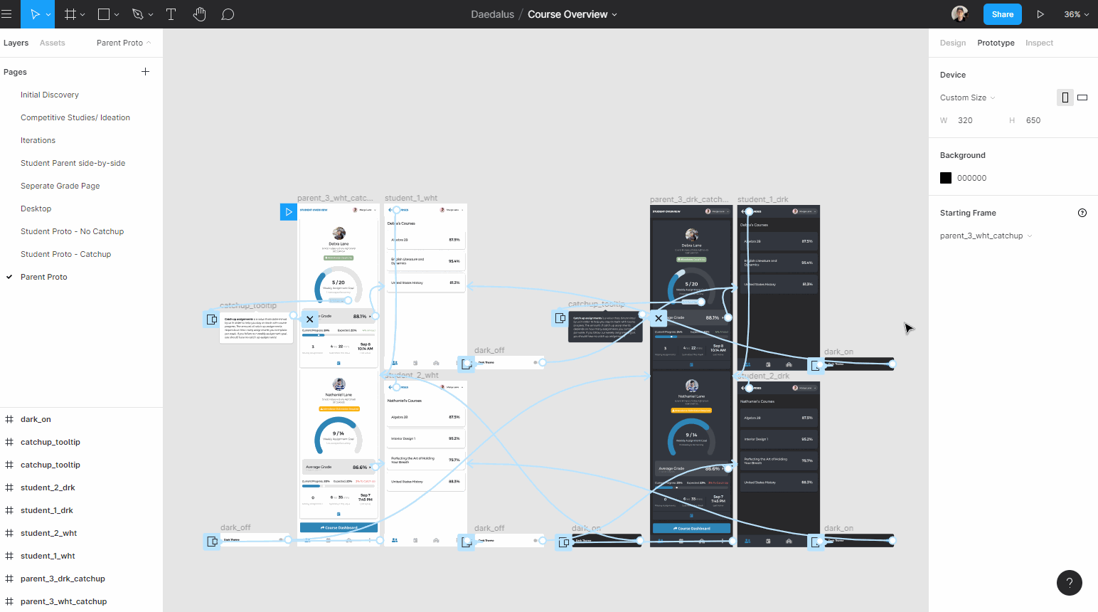
Visual design iteration board
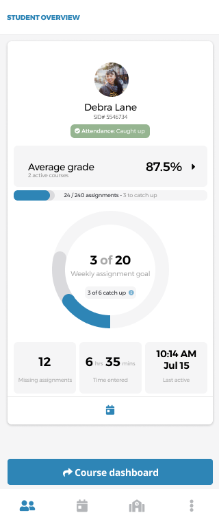
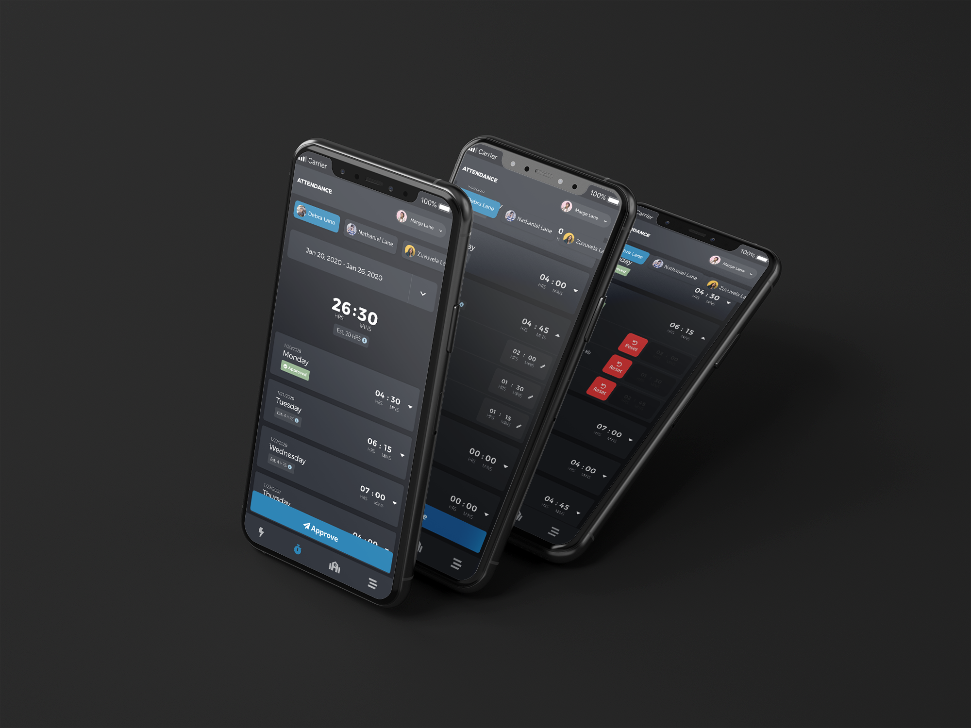
Round 2 findings confirmed stronger comprehension of the layout and weekly progress circle. Attendance Status scored 4.9/5 for ease of understanding. The catch-up concept remained a challenge and was flagged for future iteration.
High-fidelity prototype tested in round 2
Shipped and in use
Measurable impact
What I learned
This was a large feature completed in a short timeframe with multiple rounds of real user testing. I'm proud of the speed of collaboration and the volume of learning it generated.
- 1Things that seem simple to designers are often misunderstood by users. The catch-up assignments concept seemed logical internally; users found it consistently confusing.
- 2Users generally want to dive deeper into specifics. The overview was appreciated, but course-level data was where engagement truly lived.
- 3Guerilla testing, even with one well-chosen person, surfaces issues worth solving before committing to full research sessions.