About the project
Trainual customers were tracking their business software in spreadsheets, Google Docs, or not tracking it at all, leaving them with uncontrolled spend, redundant subscriptions, and new employees having no idea what tools they needed. After the CEO heard consistent feedback about this pain point, I was tasked with designing a complete tracking system from the ground up.
The opportunity was twofold: solve a real customer problem, and gather strategic intelligence on what software our customers actually use, data that could directly inform our integration roadmap.
Software chaos at scale
Most companies have no idea what software they're actually paying for. Trainual customers were managing their tech stacks through spreadsheets nobody updated, tribal knowledge that left with employees, or nothing at all.
- Wasted money on duplicate subscriptions with no central visibility
- New hires had no way to know what tools they needed or who owned them
- Zero connection between the tools people used and the training that explained them
- The system needed to scale to companies with 75+ tools and handle complex visibility rules
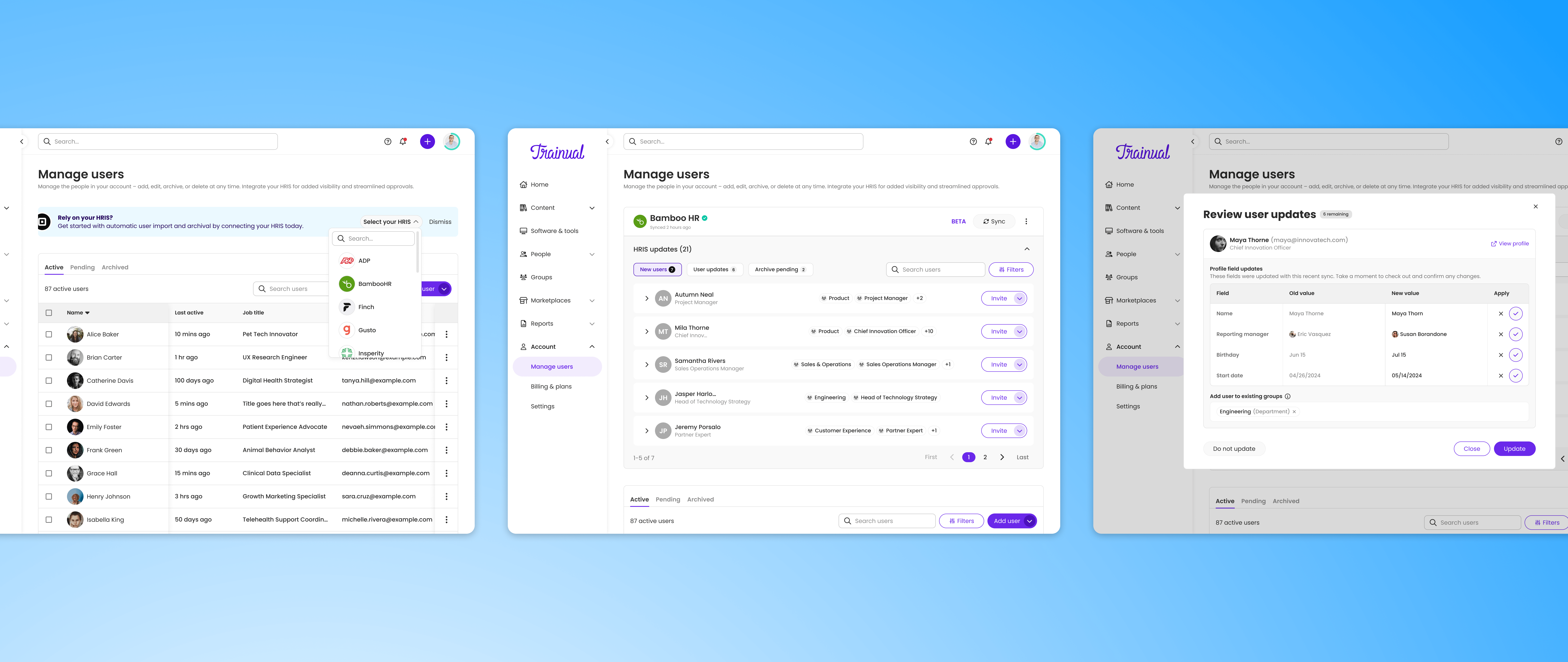
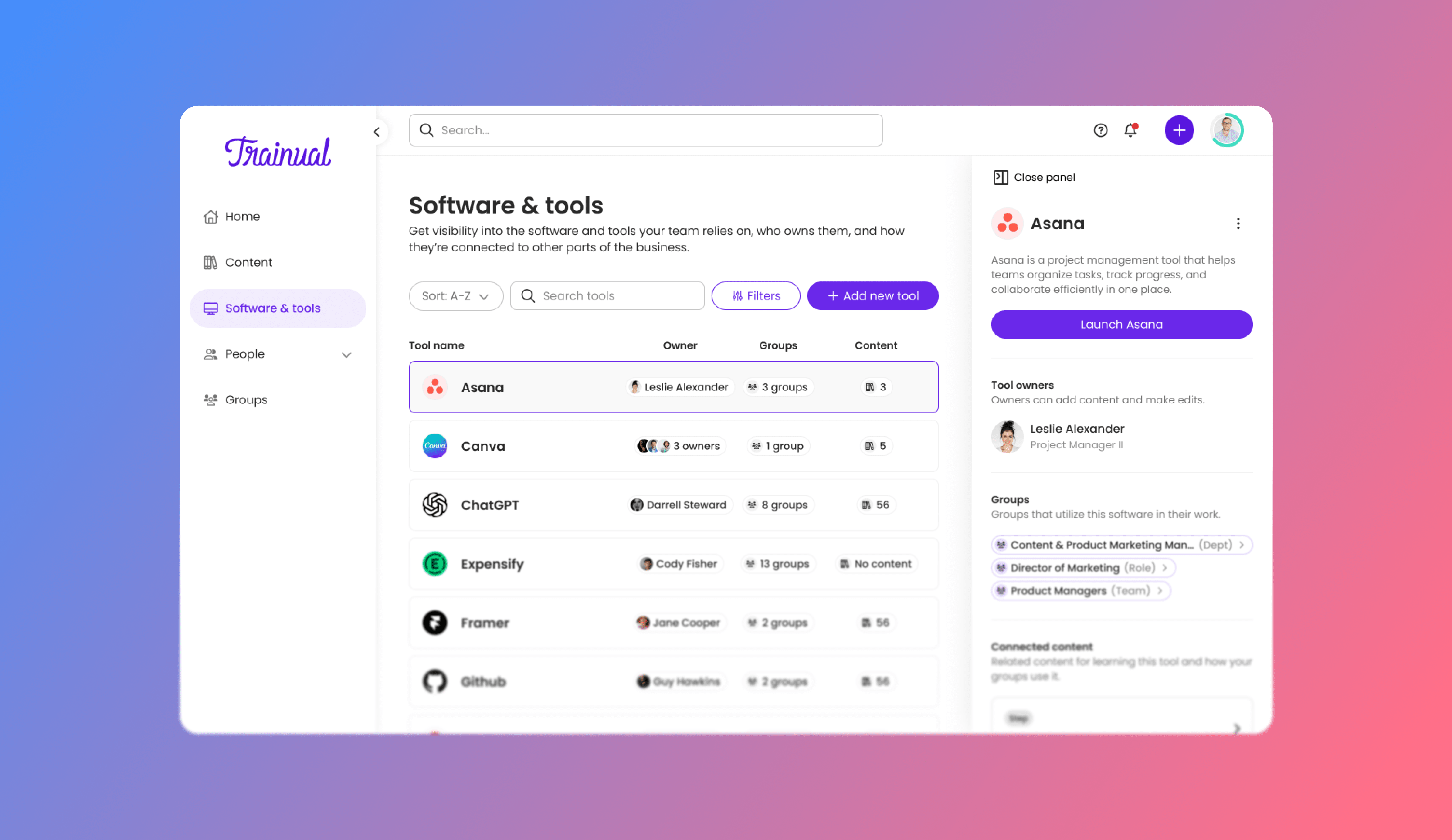
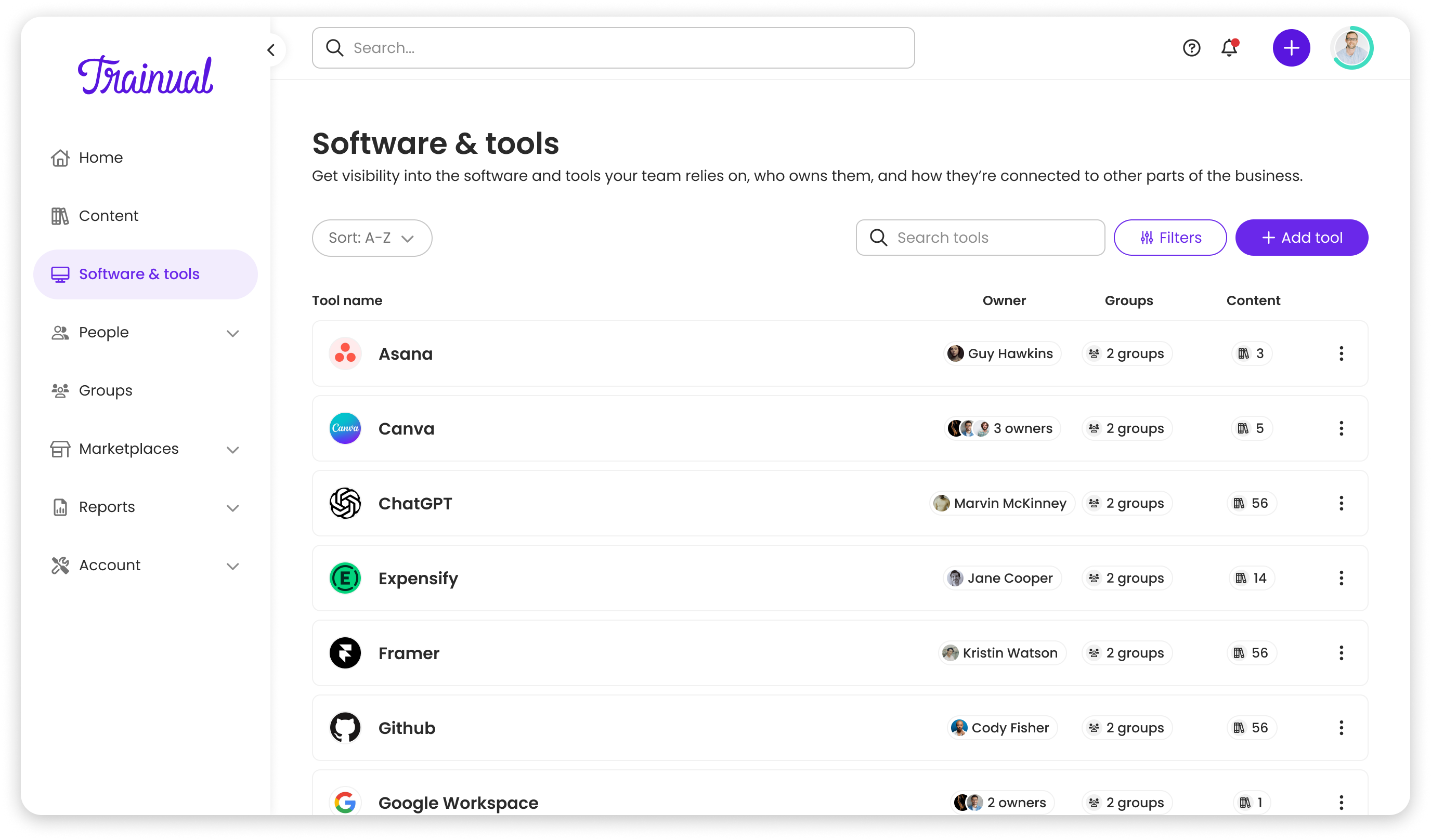
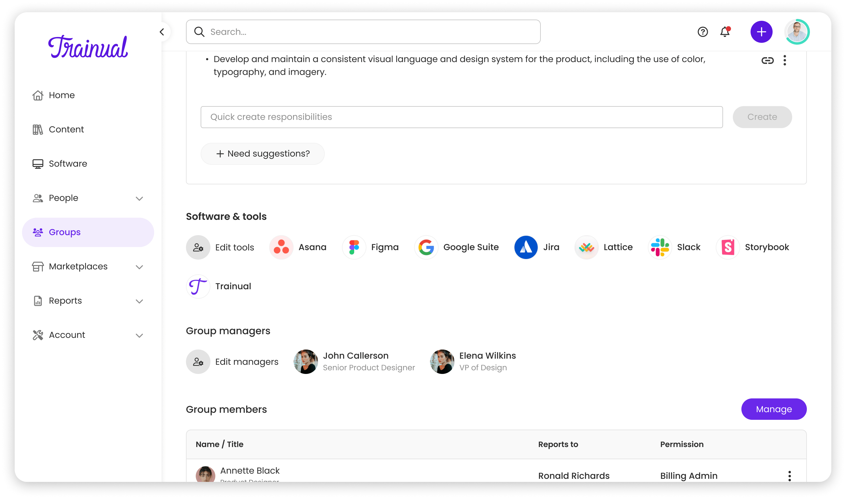
A hub, not just a list
I was the sole designer working with a fully remote team, engineering in Ukraine and PM in the US. The 10-hour timezone difference meant heavy reliance on async communication through Loom, detailed Figma comments, and thorough documentation.
We conducted 6 customer interviews and Typeform surveys with 40+ users. 4 out of 6 interviewees mentioned trouble finding who to ask about tool access during onboarding. Ownership and visibility were the critical pain points.
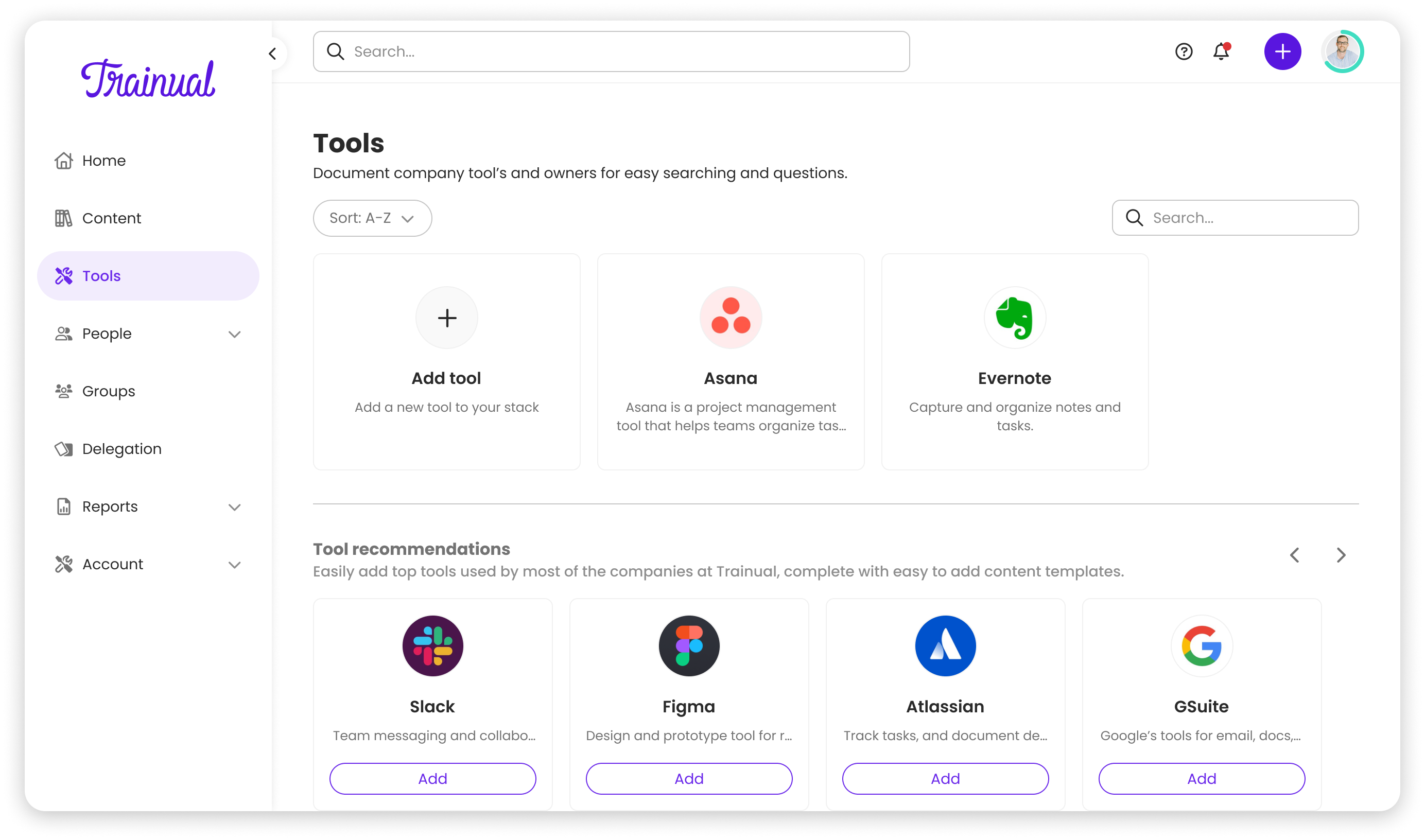
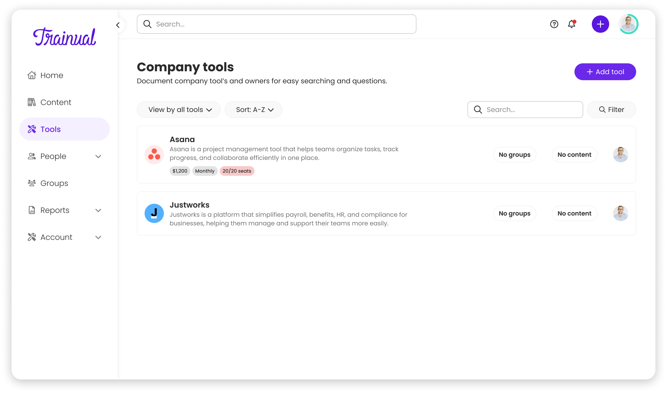
Tiles vs. rows
The CEO's initial whiteboard sketch showed a tile-based UI, compact and visually appealing. But as I designed, it became clear tiles wouldn't scale. Users would need to click into every tile to see ownership, groups, or training links. For someone managing 30+ tools, that's inefficient.
I advocated for a row-based layout instead, aligned with Trainual's design principle: "Context over brevity." After seeing how rows surfaced ownership and training links without additional clicks, the CEO aligned immediately; the research made the decision clear.
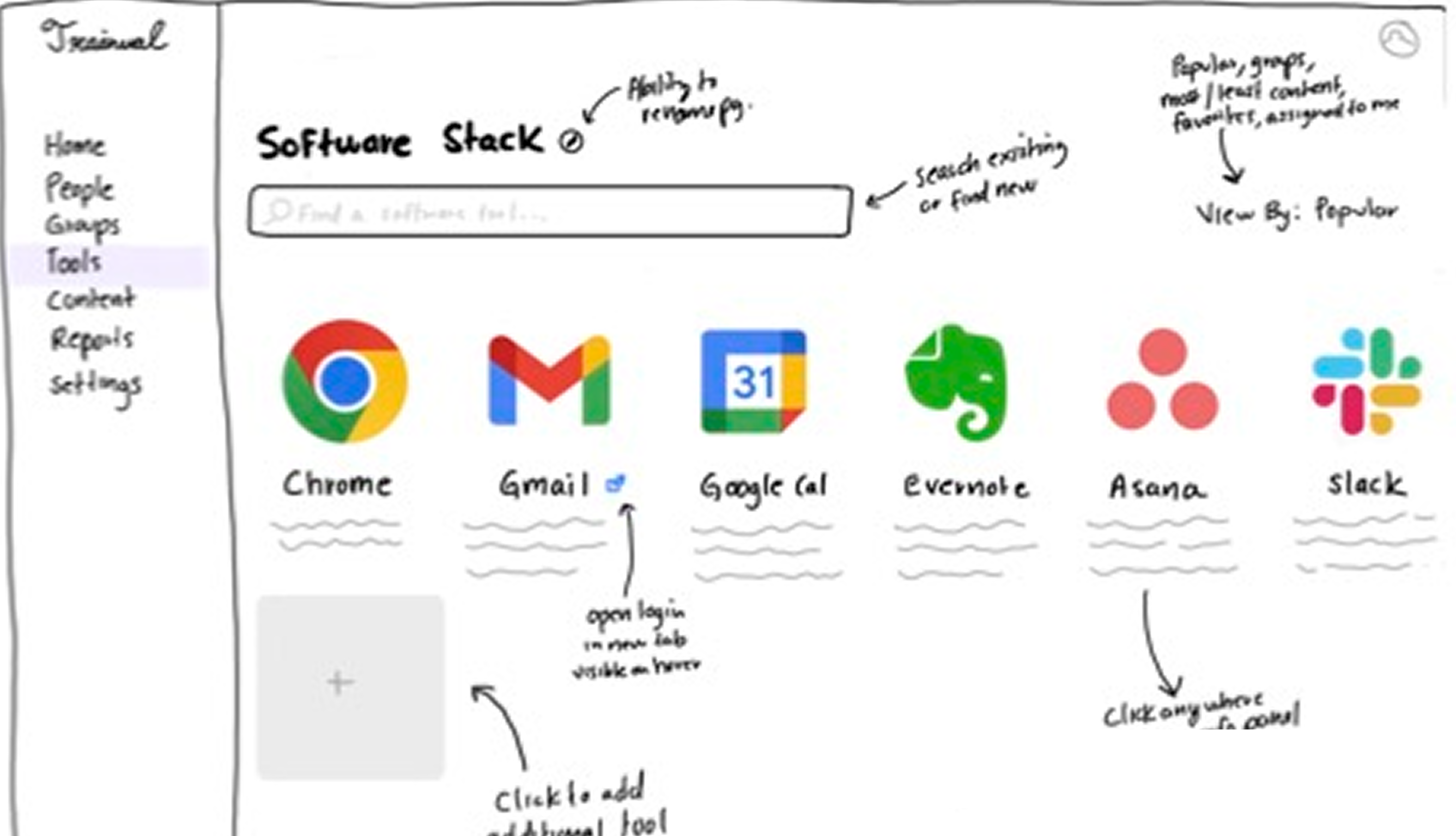
CEO sketch vs final list
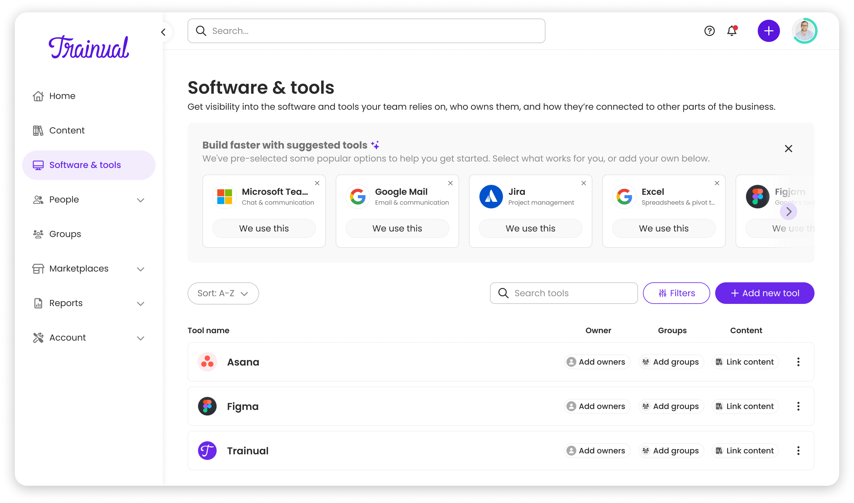
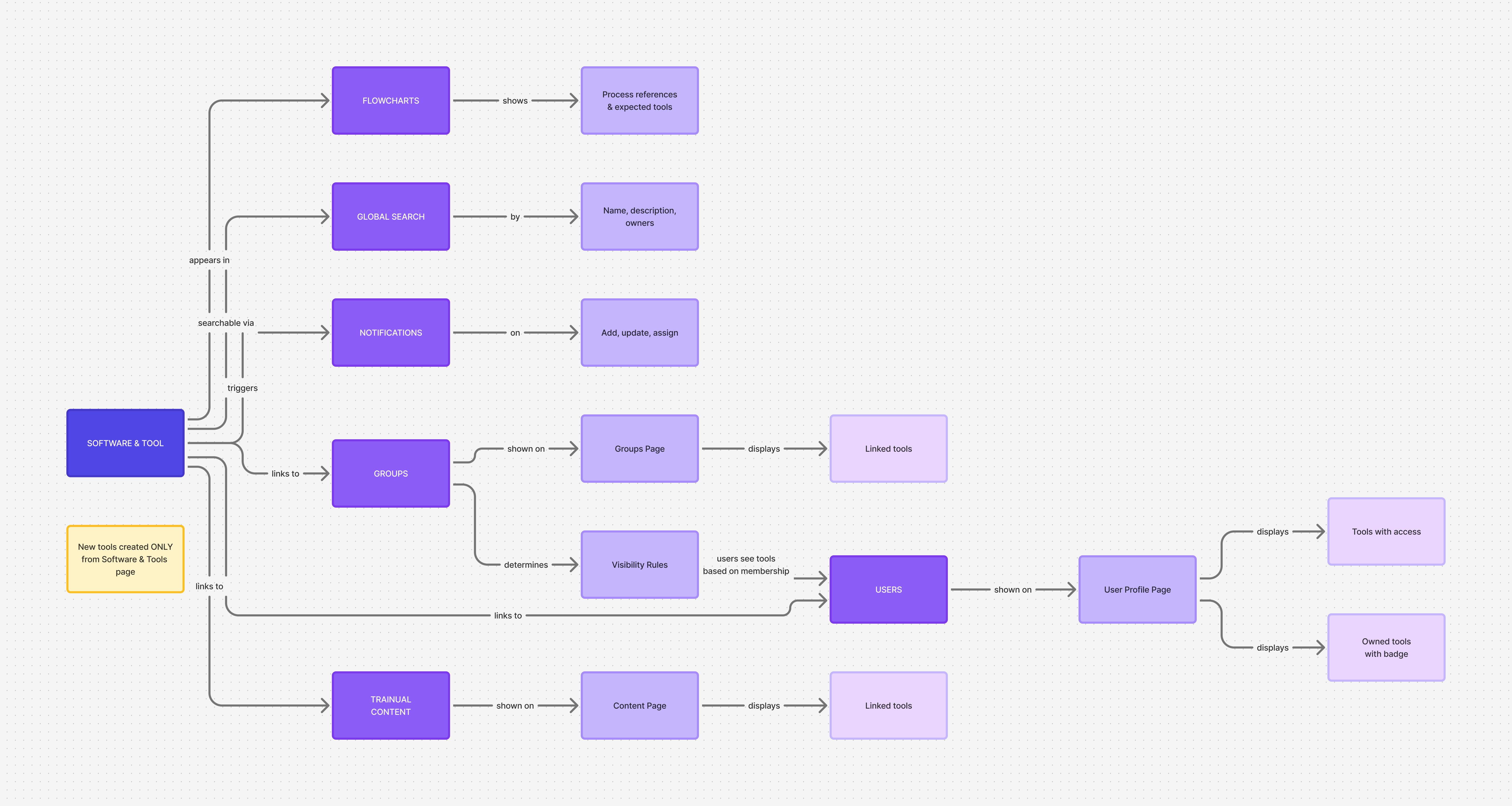
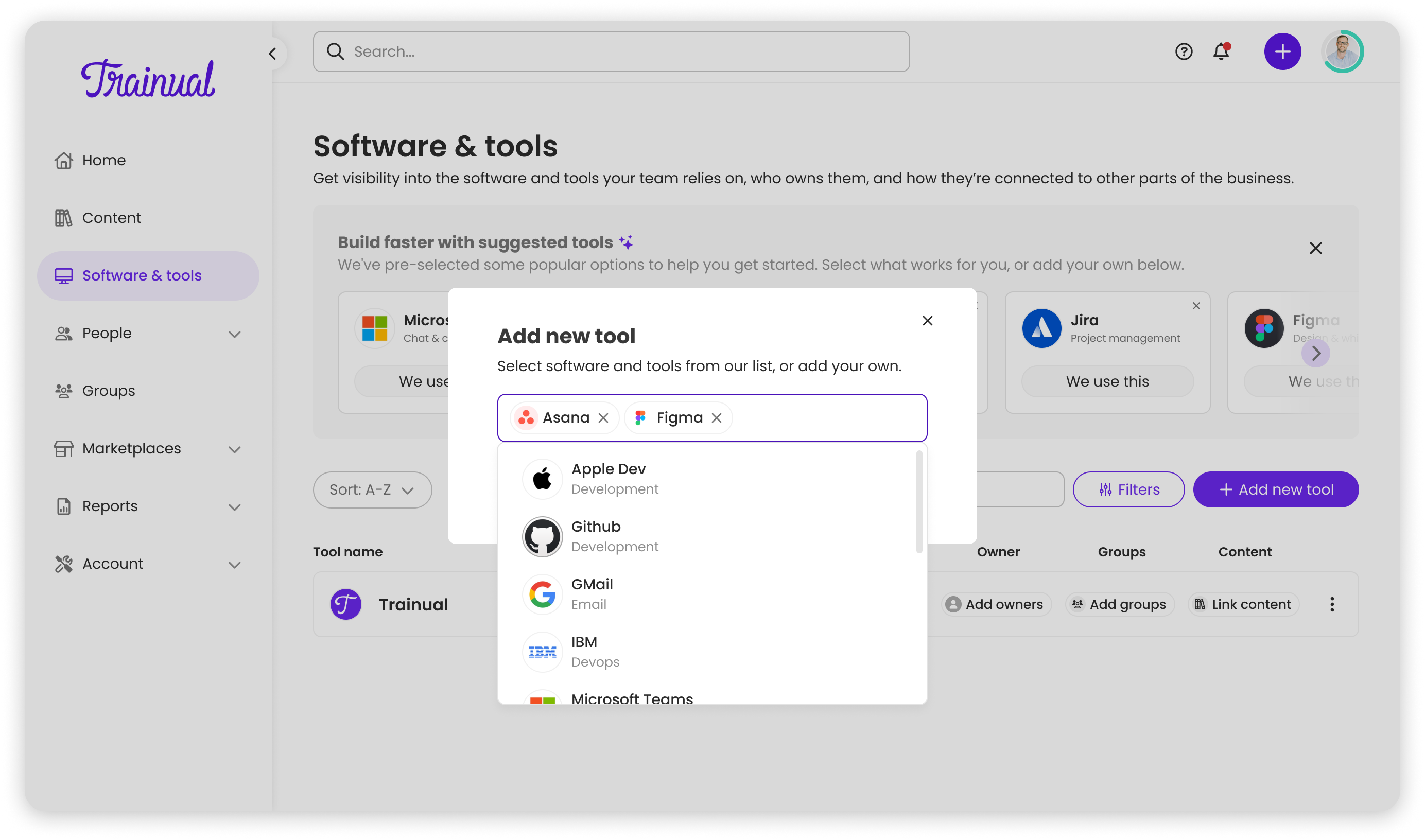
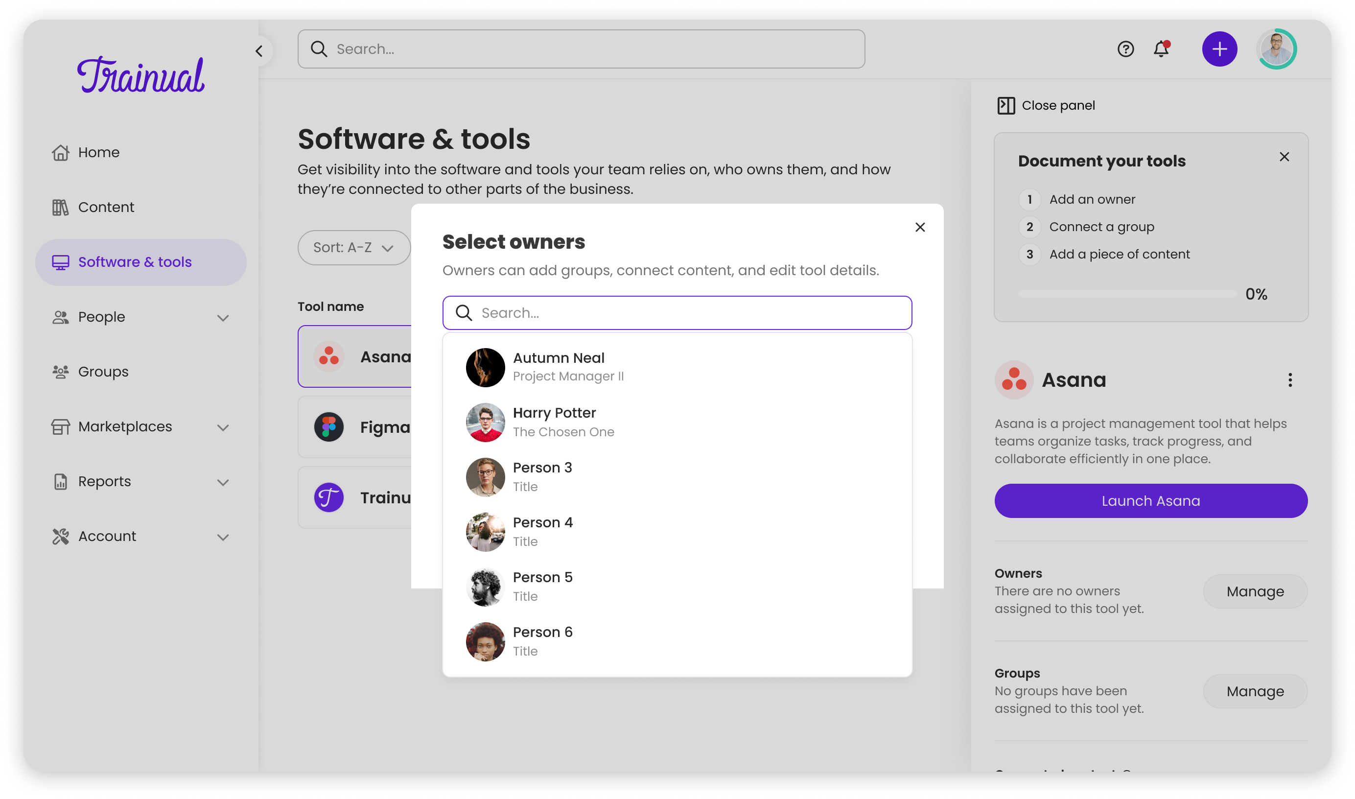
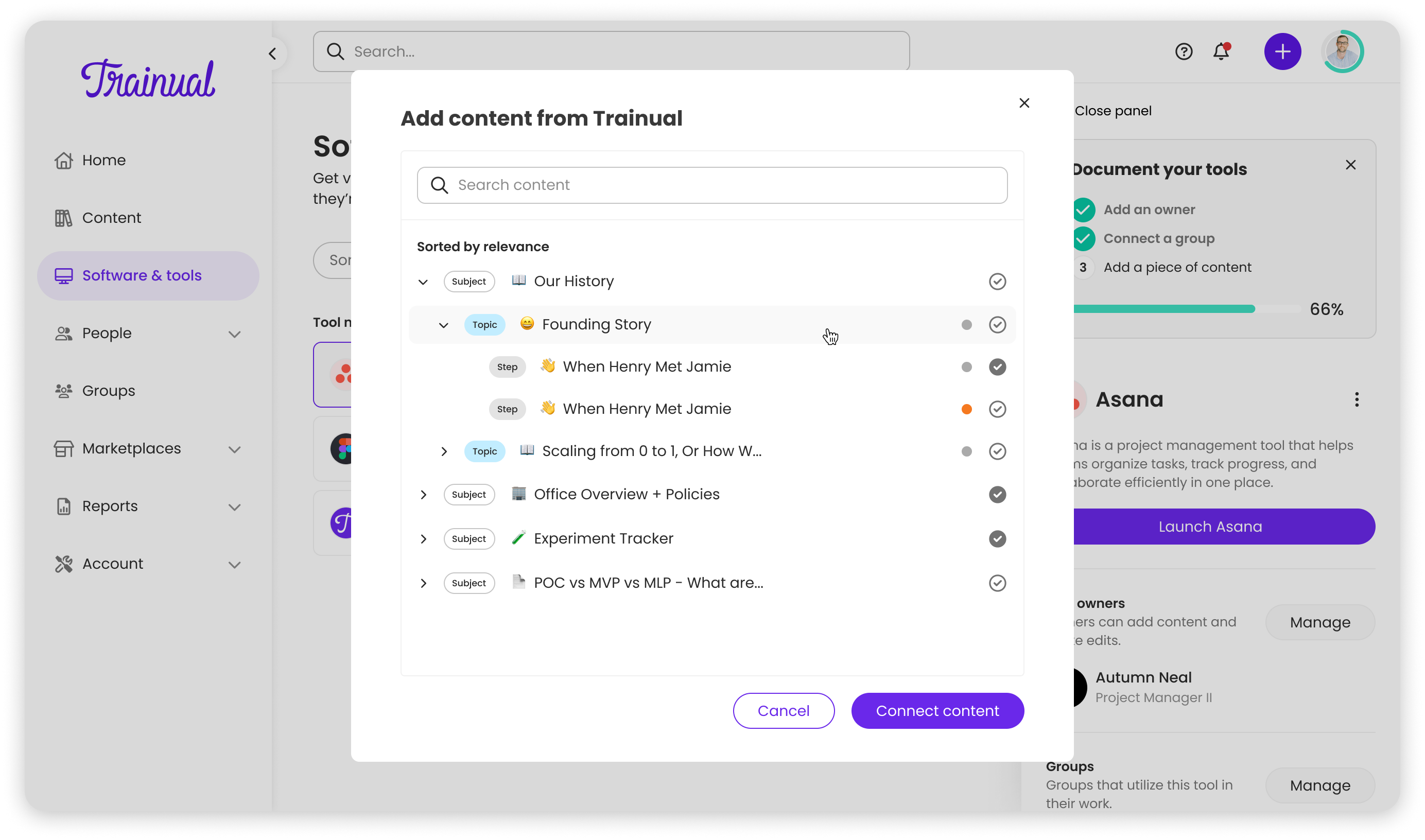
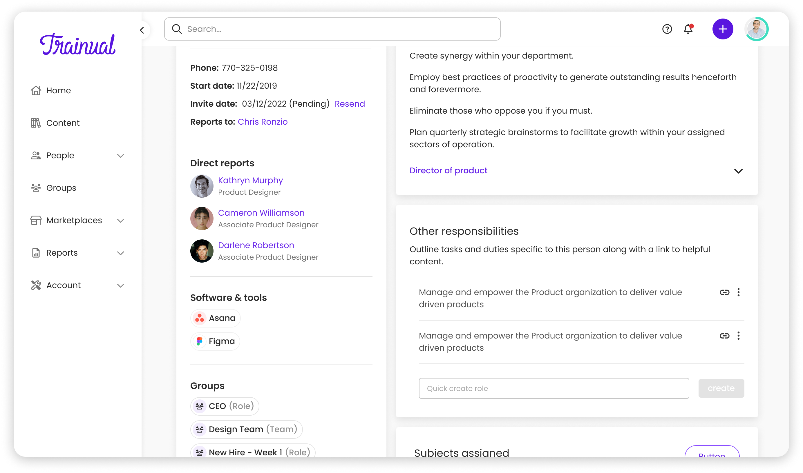
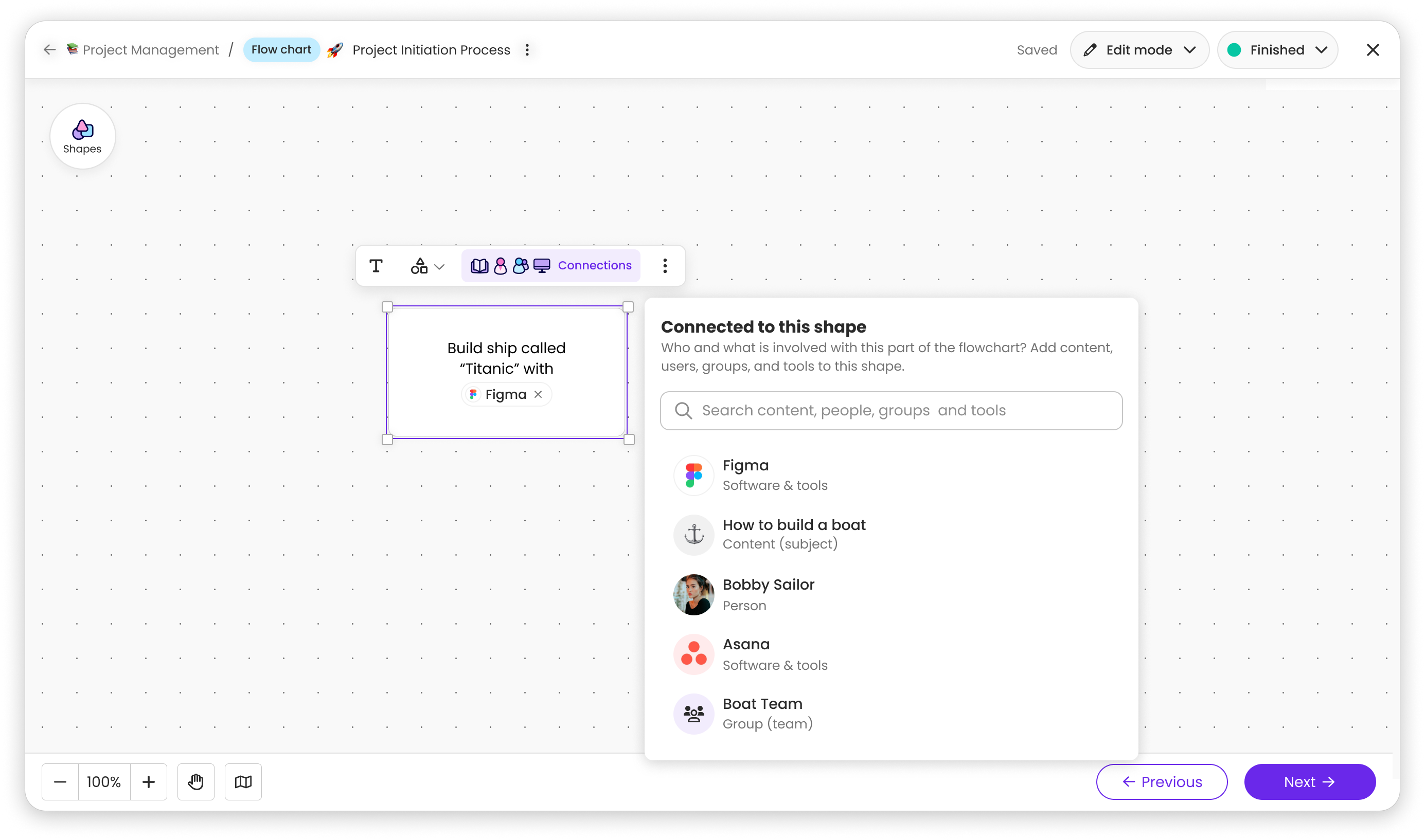
Adding a new entity type to an existing product touches everything. I mapped Software & Tools across global search, user profiles, group pages, flowcharts, notifications, and navigation early in FigJam, creating a shared source of truth that prevented us from building something that felt bolted on.
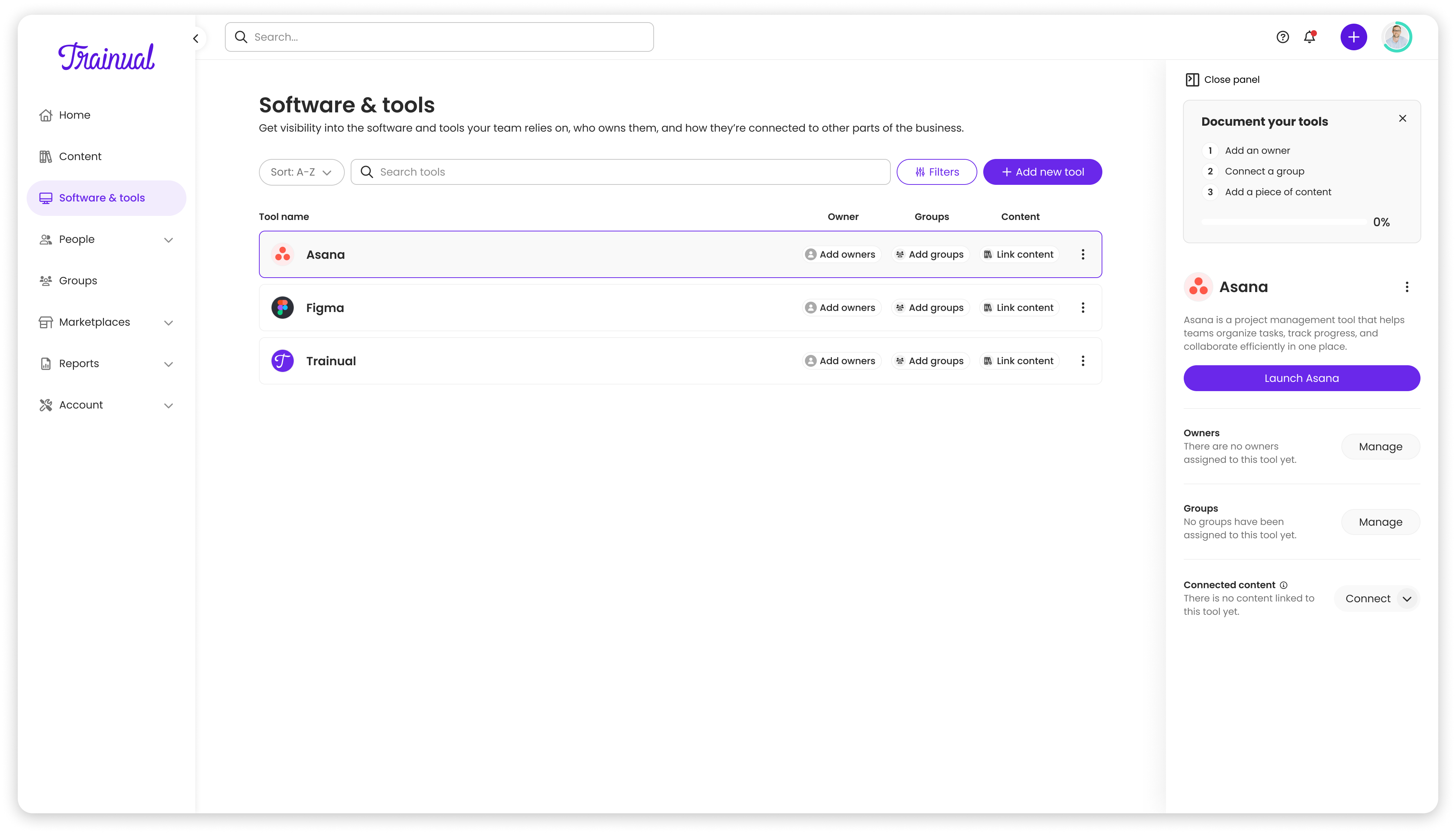
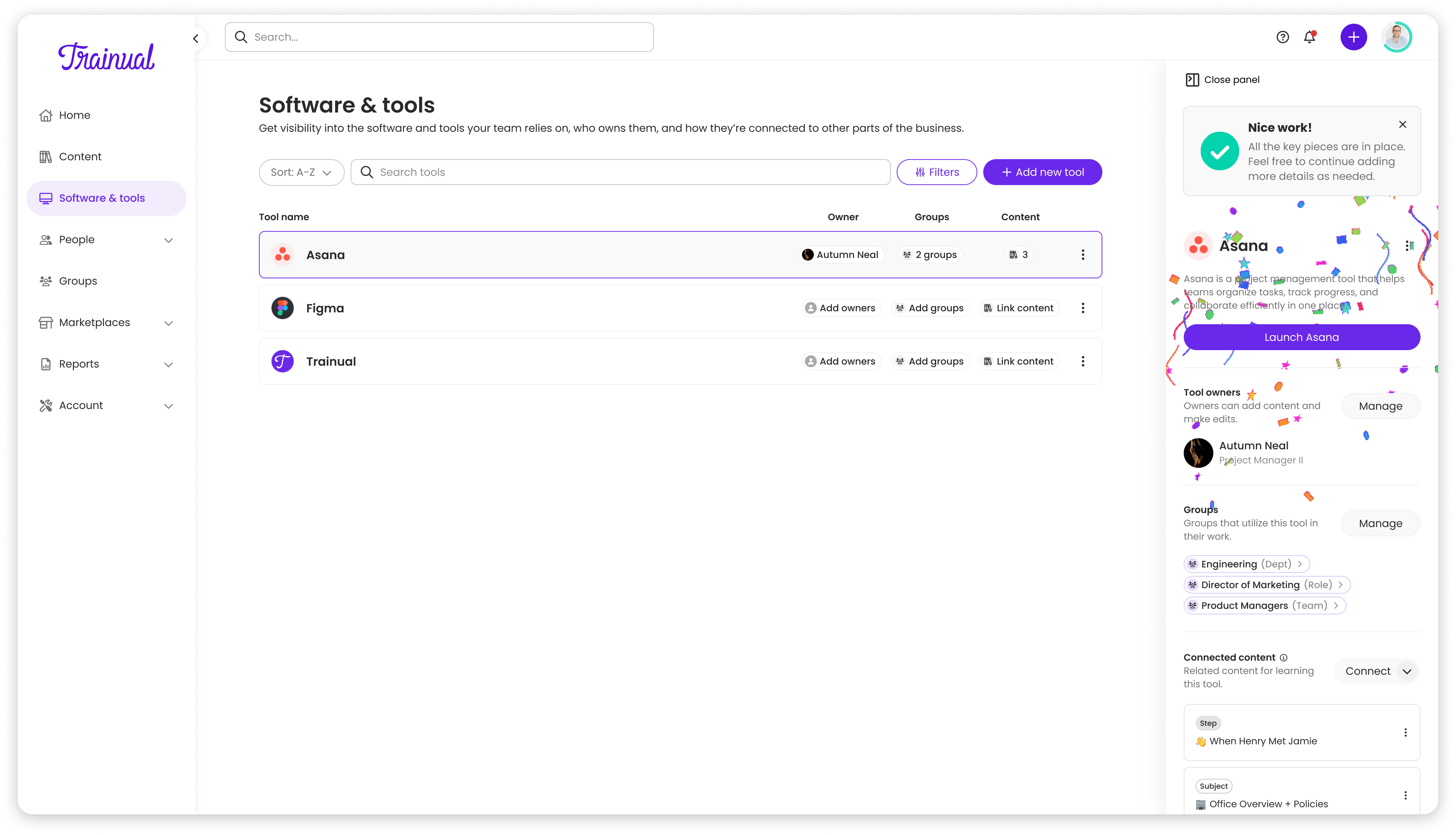
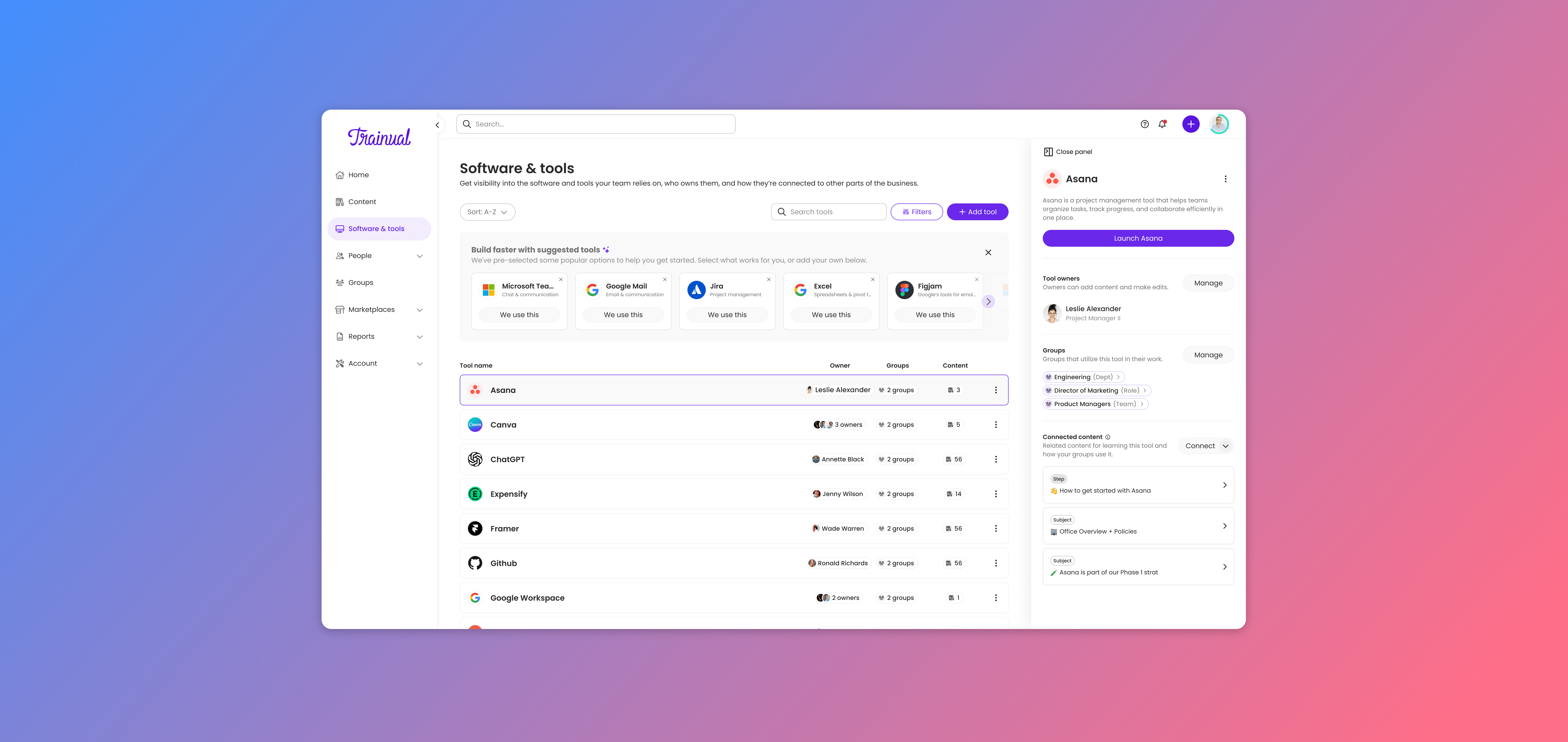
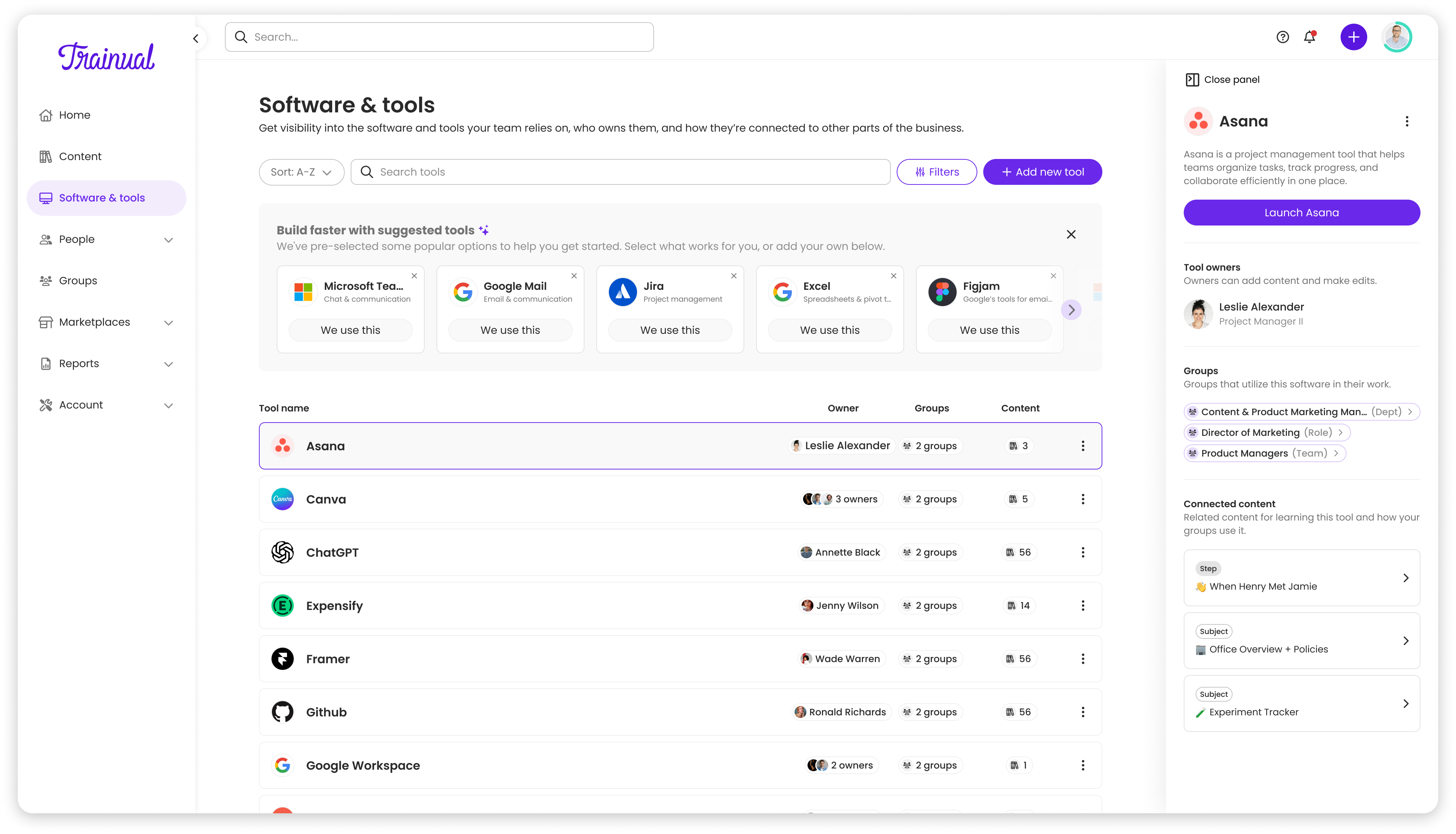
Populated vs unpopulated tool views
Round 1 usability testing deck — Dec 2024
Post-launch usability sessions and surveys surfaced that editing and replacing tools was buried in dropdown menus, and navigation positioning wasn't obvious. We added inline hover states for editing, making actions more discoverable without cluttering the interface.
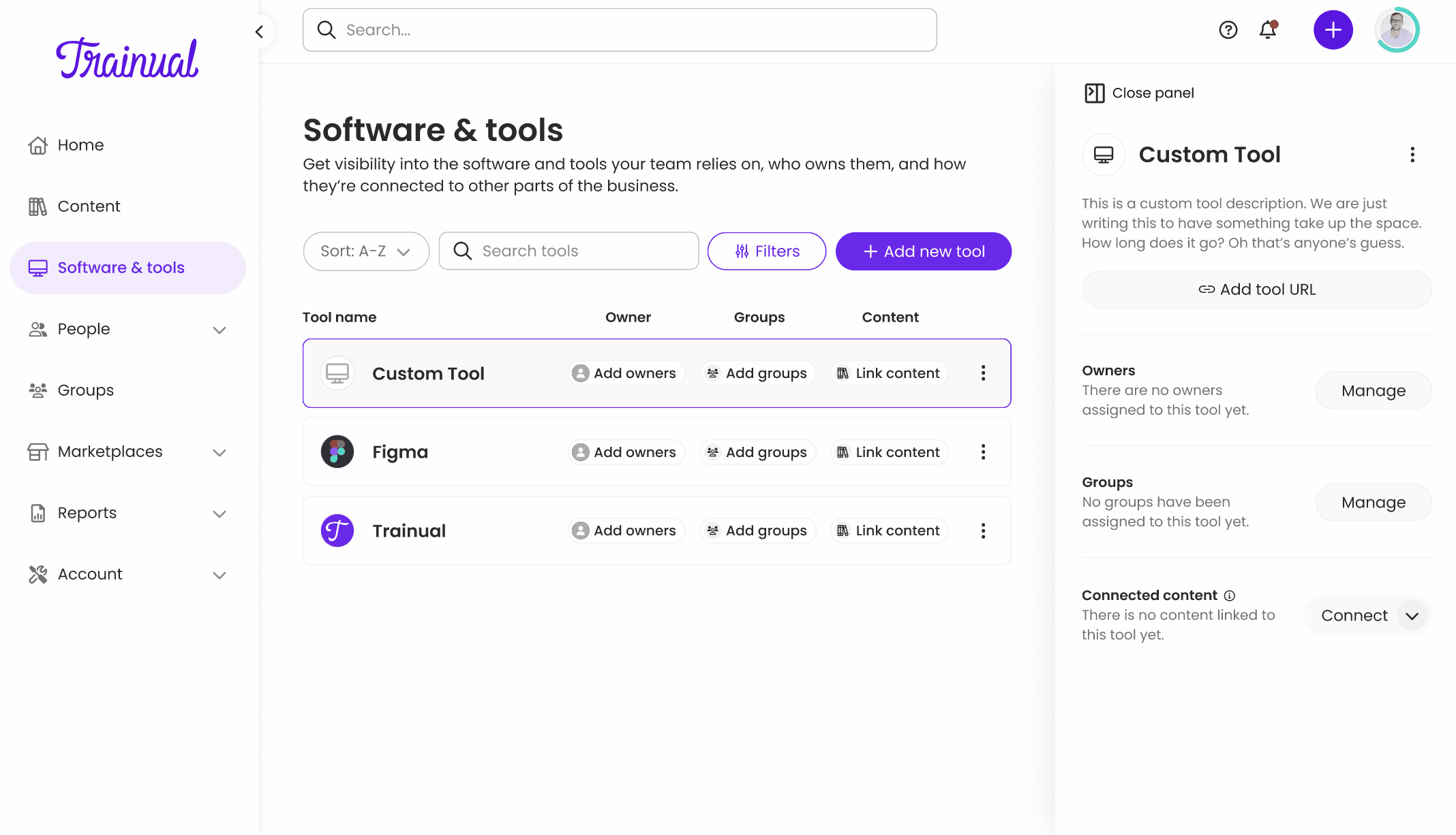
New hover-state edit experience
Shipped and adopted
Data-driven impact
What I'd do differently
- 1Advocate with evidence. Challenging the CEO's tile layout worked because I came with user research and prototypes, not just opinions.
- 2Think in systems. Mapping how Software & Tools would integrate across Trainual prevented it from feeling tacked on.
- 3I would have framed the dedicated detail page not as "more features" but as "room to grow," showing how the panel would constrain future additions would have made the tradeoff tangible.