Background
Where it all started
Realize was the first professional project I worked on as a UX designer. I was brought onto a team to help deliver the next iteration of Pearson's flagship K–12 learning platform, where teachers create classes, assign content, and track student performance, and over 6.5 million students complete work, check grades, and browse content.
The platform is divided into three core sections, each with its own identifying color carried consistently across all sub-pages: Programs, Classes, and Data.
Axure · Prototyping
HTML & CSS · Front-End
Responsive · Multi-Device
Usability Testing · Validation
Style Guide · Documentation
LTI · Platform Integration
Core Experience
Three pillars, one platform
Home, Programs, Classes, and Data: the four core views of Realize
Feature Work
LTI integration, from the ground up
After Pearson received LTI Certification from IMS Global, they needed a way to ingest and export common cartridges to link to external content. This feature didn't exist; I designed it from scratch within the existing Realize design system.
The biggest challenge: presenting metadata-rich content in a way that was easily accessible but unobtrusive. The solution was a clickable, hoverable row pattern where full details could be viewed and edited inline without navigating away.
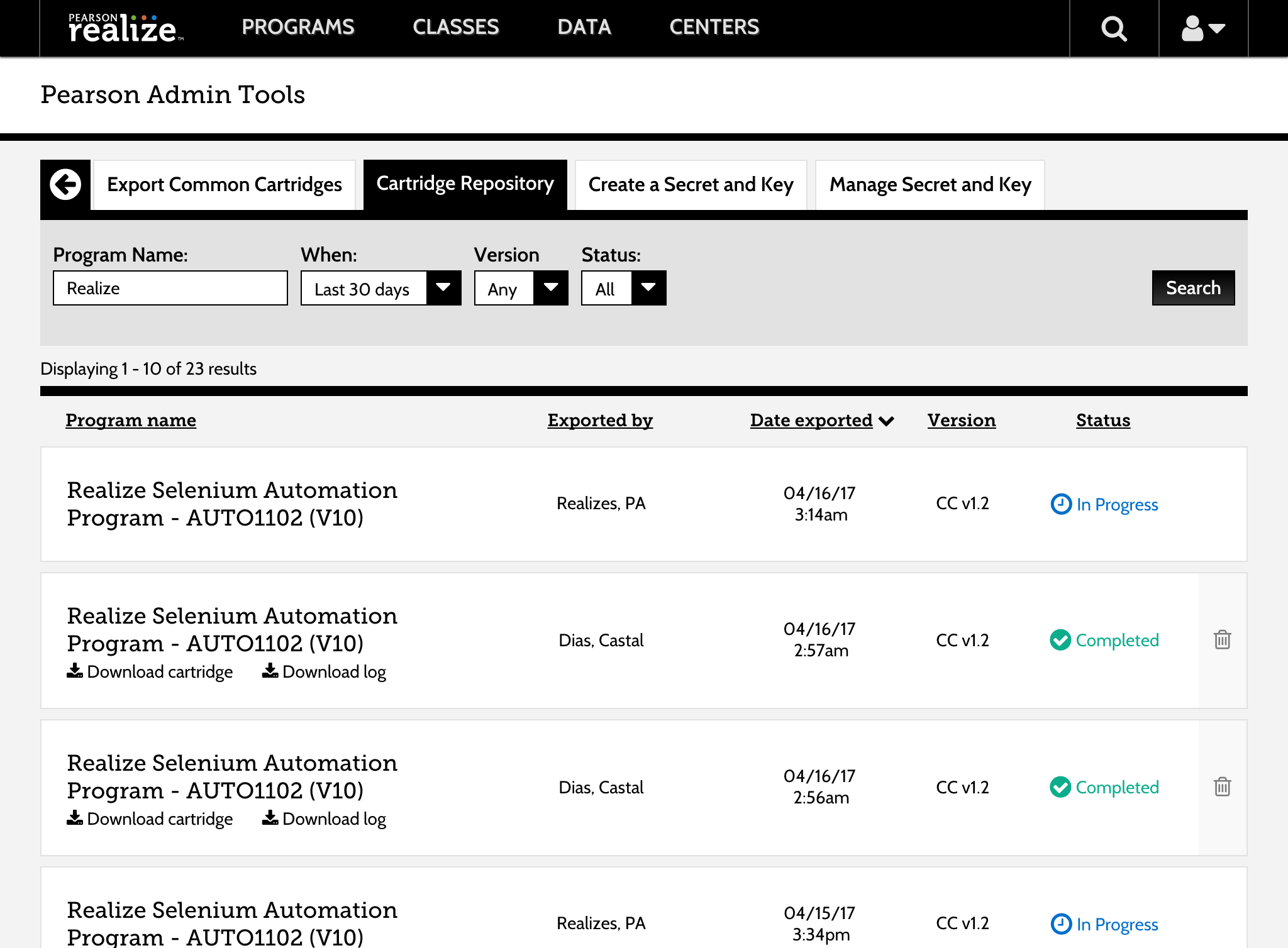
LTI list, edit, and cartridge repository views
Responsive Design
Desktop-first, then tablet-ready
With over 20% of users on tablet devices under 768px, I worked with another designer to make nearly every screen and scenario in Realize responsive down to 540px, an unusual challenge given the product was built desktop-first.
Home, Programs ToC, and Classes responsive transitions
Learnings
What I learned
- 1Working at scale changes how you design. Every decision on Realize touched millions of students; that weight makes you think harder about edge cases and accessibility.
- 2Retrofitting responsiveness to a desktop product is genuinely hard. Going mobile-first whenever possible is a lesson I carried forward from this project.
- 3Rapid prototyping with Axure and HTML/CSS taught me that fidelity should match the question you're trying to answer, not the ego of the designer.