Summary
After the CEO heard consistent feedback from customers about software tracking pain points, I led the design of a complete tracking system that extended Trainual’s business operations capabilities. Over 3 months, I designed an end-to-end solution that served 150,000+ users and provided critical data for our product strategy. The result: 7,000+ unique tools documented, direct influence on our integration roadmap, and a feature that significantly increased customer retention.
Software & Tools
Turning software chaos into centralized clarity and strategic advantage.
Role
Product Designer
Discovery, UX, UI, Prototyping
Project Duration
3 Months
Discovery → Launch
Company
Trainual
In-house | B2B SaaS
About the Project
Trainual customers were tracking their business software in spreadsheets, Google Docs, or not tracking it at all. This meant uncontrolled software spend, redundant subscriptions, and new employees having no idea what tools they needed. One customer told us during research: “I’d love for this to come to Trainual. It’d take us out of spreadsheets and Google Docs tracking this stuff.”
Leadership saw an opportunity to expand Trainual’s business operations capabilities by building on our existing delegation and responsibilities features. Software tracking would help customers document their tech stack while giving us strategic intelligence: What software do our customers actually use? This data would inform our integration roadmap, transforming guesswork into data-driven strategy.
I was tasked with designing the system from the ground up.
The Problem
Most companies have no idea what software they’re actually paying for. Trainual customers were managing their software stacks through:
- Spreadsheets that no one updated
- Google Docs buried in someone’s personal drive
- Tribal knowledge that disappeared when employees left
- Or nothing at all
This created real problems: wasted money on duplicate tools, frustrated new hires trying to figure out what they needed access to, and zero connection between the tools people used and the training that explained them.
The challenge wasn’t just building a list. I needed to design a system that would:
- Scale to companies with 75+ software tools
- Handle multiple owners, complex visibility rules, and group assignments
- Drive daily usage by connecting tools to training and enabling quick launch
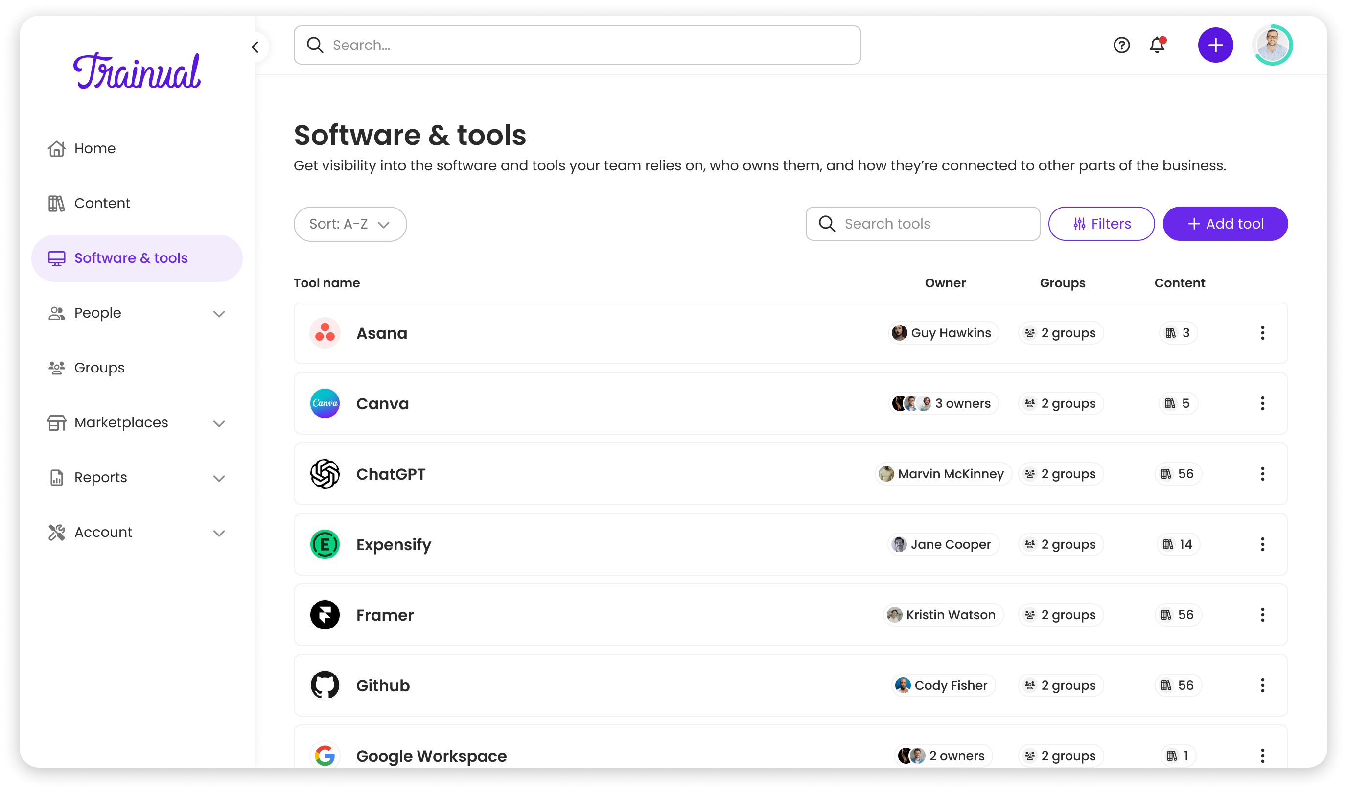
- Integrate seamlessly across Trainual’s entire platform (search, profiles, groups, flowcharts, notifications, action center)
The Solution
Intro
I was the sole designer on this project, working as part of Trainual’s Partnerships squad. The entire team was fully remote, with engineering in Ukraine and myself and my PM in the US. The 10-hour timezone difference meant limited windows for synchronous collaboration. We relied heavily on async communication through Loom, detailed Figma comments, and thorough documentation to keep the project moving.
The team:
- 1 Product Designer (me)
- 1 Product Manager
- 4-5 Engineers (Ukraine-based)
My toolkit:
- Figma – Design & prototyping
- FigJam – User journeys & flows
- Miro – Diagrams & collaboration
- Jira – Task tracking
- Loom – Async videos & comms
Process
Discovery & Definition
Dani, my PM, had validated through competitive analysis that no competitor was addressing software tracking in our space. My focus was understanding what customers actually needed from a software tracking system.
We conducted 6 customer interviews with small business owners and followed up with Typeform surveys to 40+ users to validate findings at scale.
Key insights:
- 4 out of 6 interviewees mentioned trouble on remembering or finding who to ask about tool access when onboarding new employees. Ownership and visibility were critical pain points
- Users wanted quick access to company-specific tool URLs rather than hunting through bookmarks or internal wikis
- Connecting tools to training documentation would eliminate the “which tool do I use for what?” confusion during onboarding
- Visibility needed to be role-based. Showing finance teams engineering tools or content related to other groups would create noise and overwhelm
Working with Dani, I defined our success metrics and design principles that would guide the project.
Success metrics:
- Adoption: Multiple tools documented per company
- Strategic data: Real insight into customer software usage to inform our integration roadmap
- Engagement: Daily usage as a hub for launching tools and finding training
Design Exploration
Finally it was time to design. Usually before I design I like to jump into flows and IA to help inform strategy and get everyone on the same page. This time was no different. Even though we have a vision, it’s always good to have a foundation to stand on.
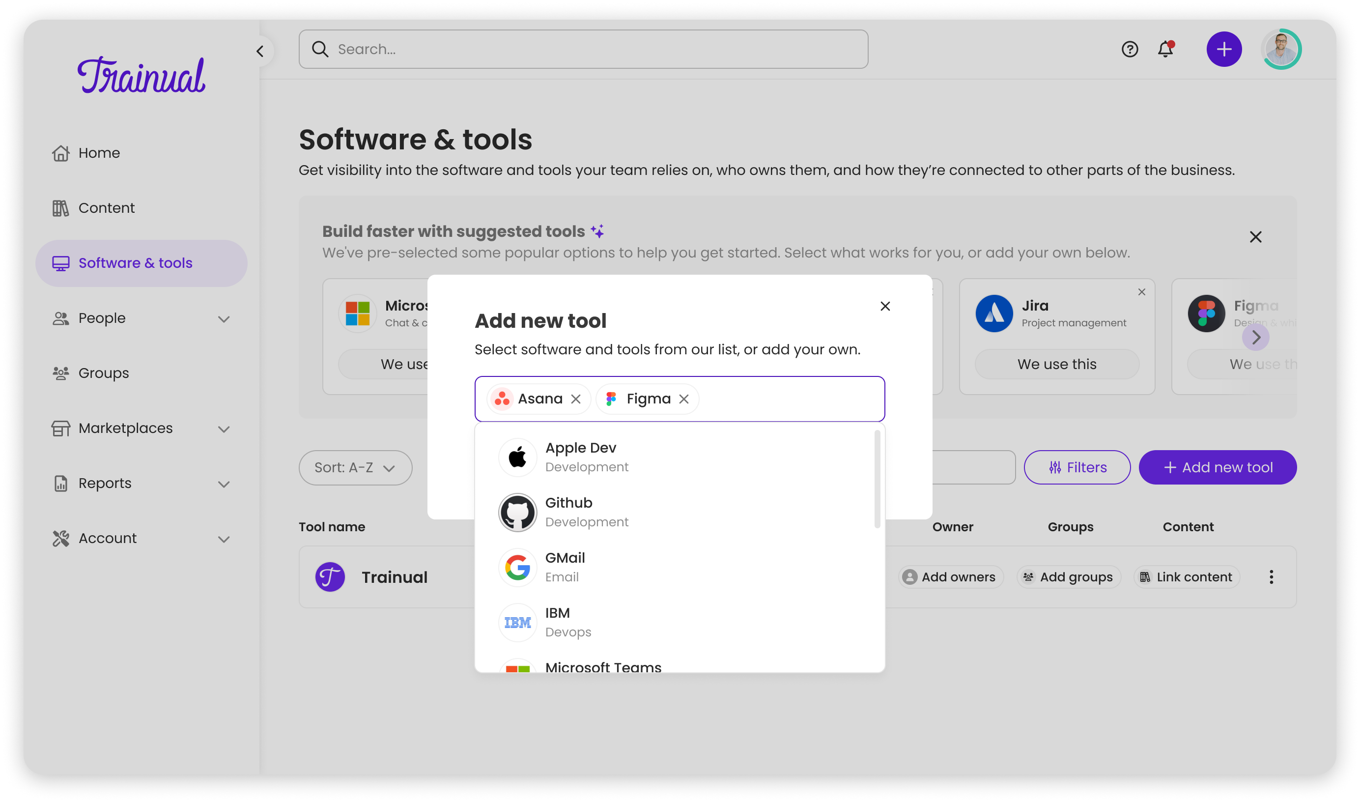
Before settling on a direction, I explored several layout approaches to understand what would scale best:
- Table formats for data-heavy users, efficient but felt too technical and intimidating for small business owners
- Tile-based grids (the CEO’s initial sketch), compact but wouldn’t scale to companies with 75+ tools
- Row-based lists, the most information-dense option that still felt approachable
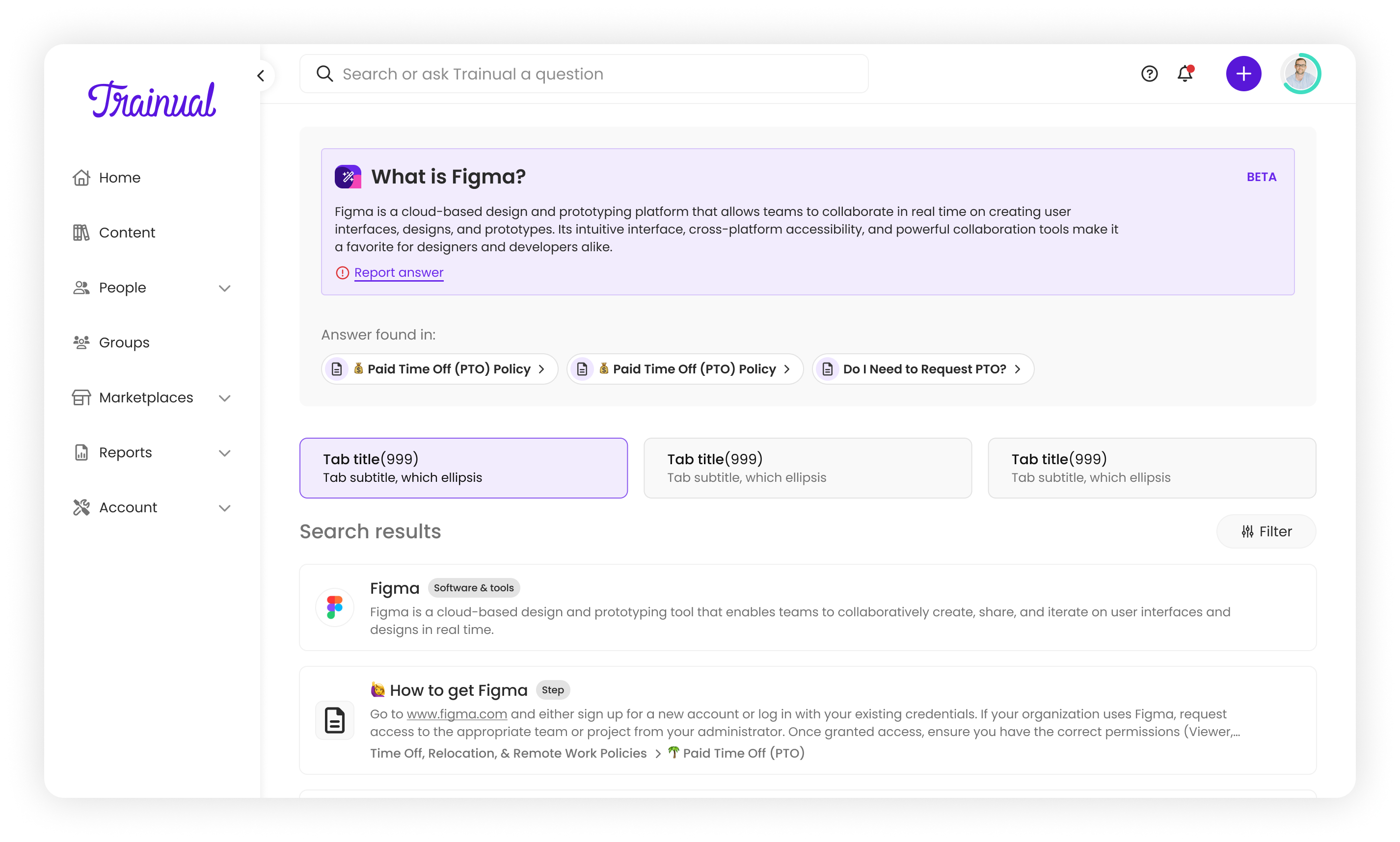
After sketching and reviewing internally with the design team, rows emerged as the strongest candidate. I built a prototype to test the hypothesis before bringing it to stakeholders.
Deciding on Tiles vs. Rows
The CEO’s initial whiteboard sketch showed a tile-based UI: compact and visually appealing. But as I designed, I realized it wouldn’t scale.
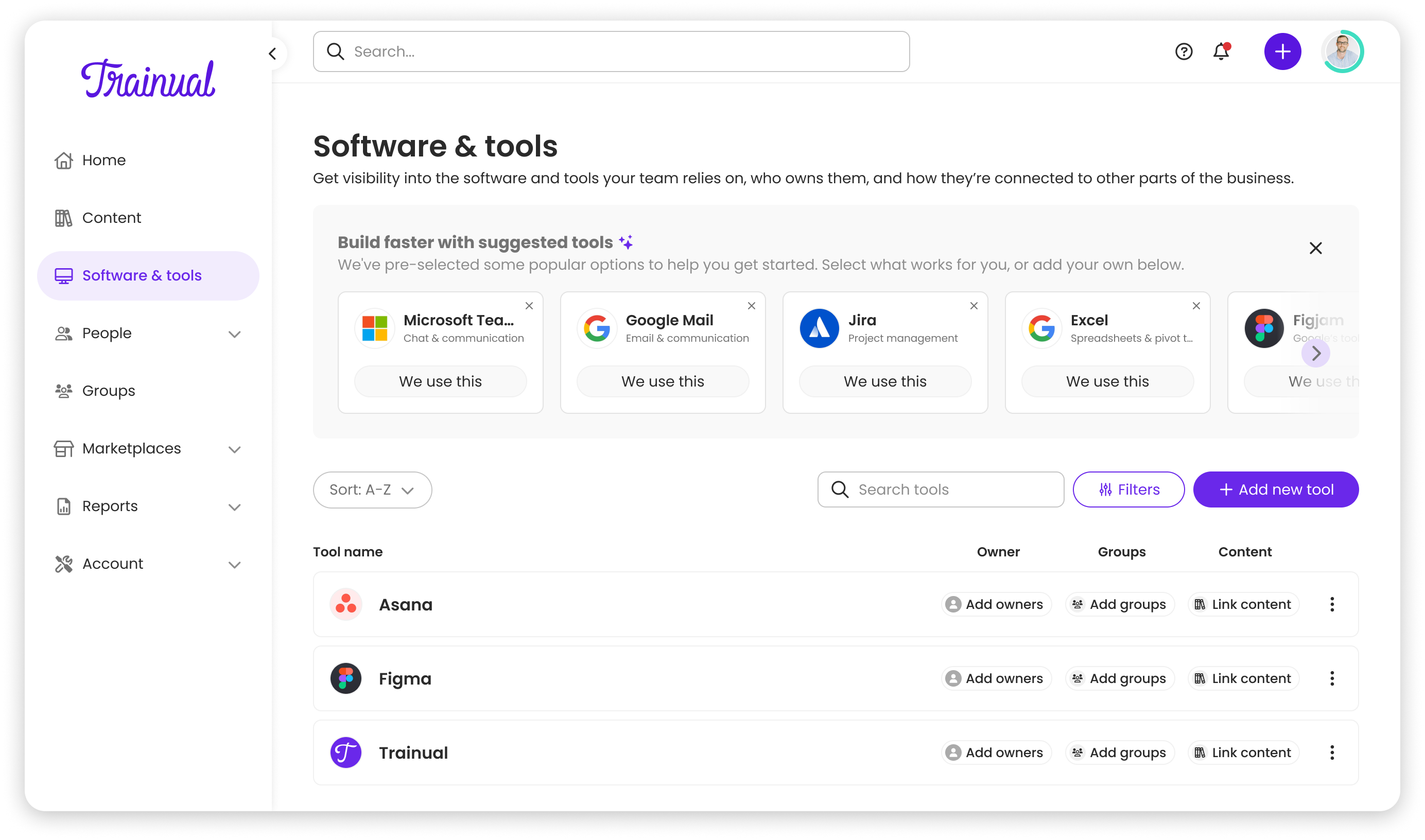
A tile-based layout would hide critical information. Users would need to click into every tile to see who owned it, who used it, whether training was linked. For someone managing 30+ tools, that’s inefficient, and clarity / information is hidden behind multiple clicks.
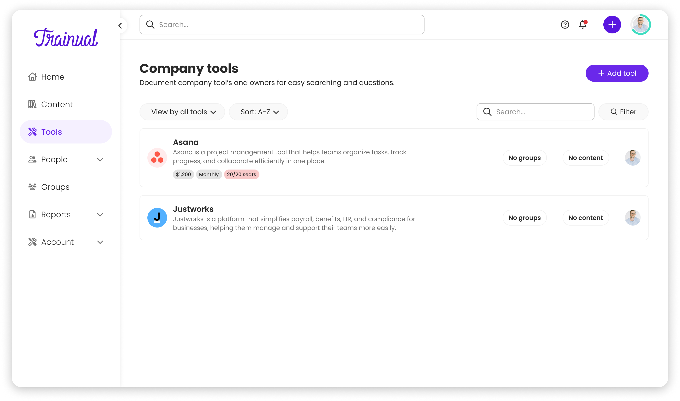
I advocated for a row-based layout instead, aligning with Trainual’s design principle: “Context over brevity.”
The trade-offs:
- ✅ Critical info visible at a glance (owners, groups, training links)
- ✅ Room for inline actions (quick launch, edit)
- ✅ Better scalability for power users
- ⚠️ Lists get longer (but search and filters handle that)
I presented the rationale to the CEO and stakeholders through user research findings and a working prototype. The CEO’s main concern was ensuring tools remained easy to access and scan quickly. After seeing how the row layout surfaced ownership and training links without additional clicks, he aligned on moving forward with rows. There was no pushback—the research made the decision clear.

Designing the System, Not Just the Feature
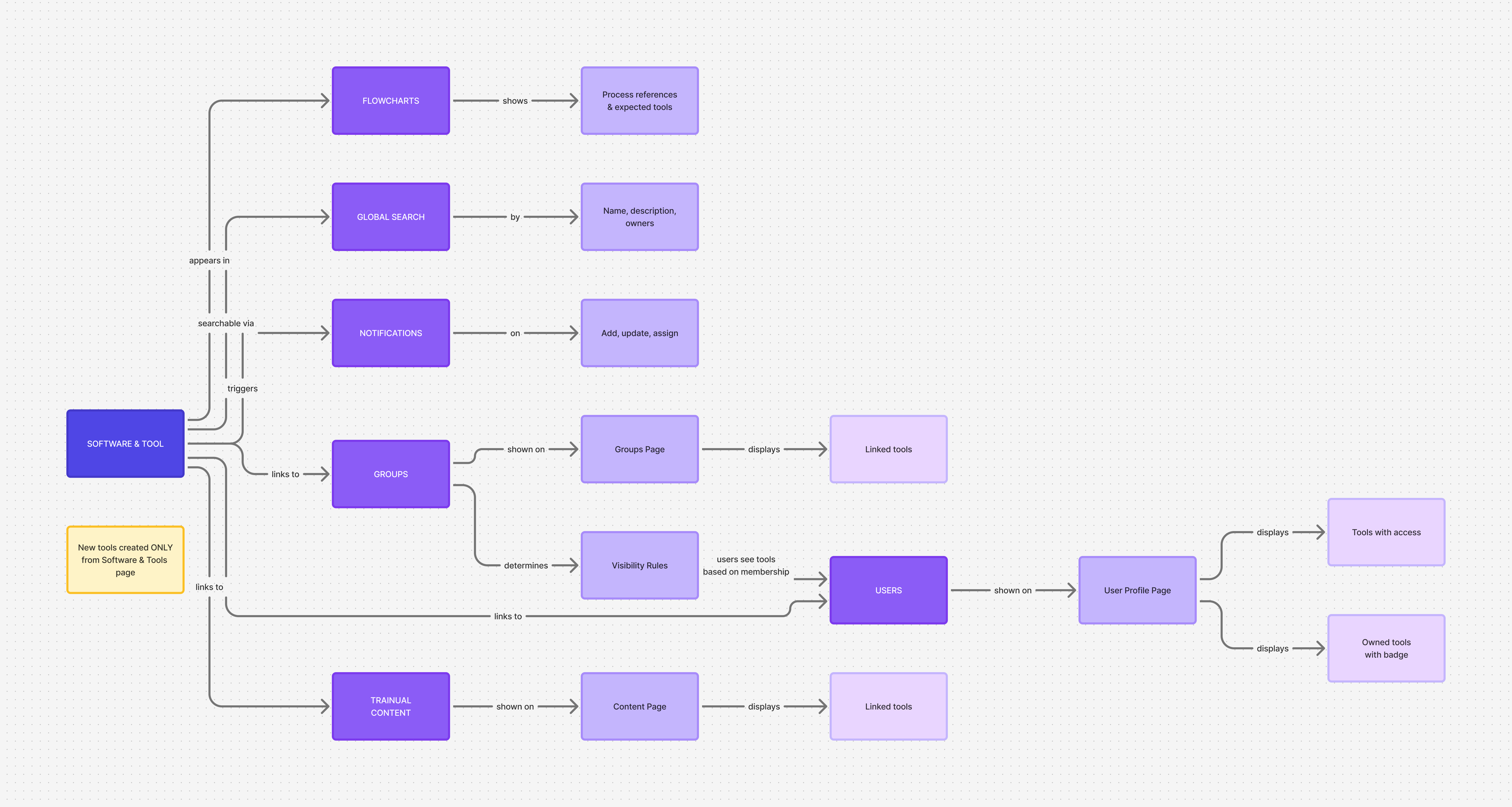
Adding a new entity type to an existing product touches everything. Software & Tools wasn’t just a new page, it was a new layer across the entire Trainual experience.
I designed how tools would appear in:
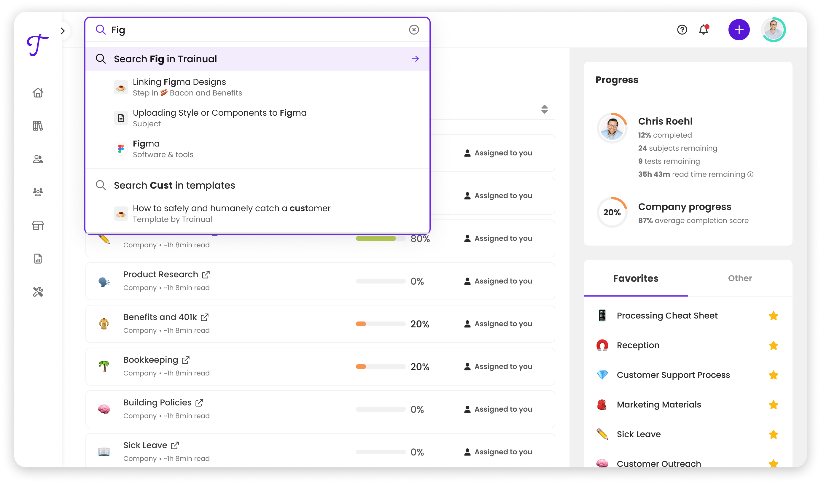
- Global search: Tools searchable alongside content and people
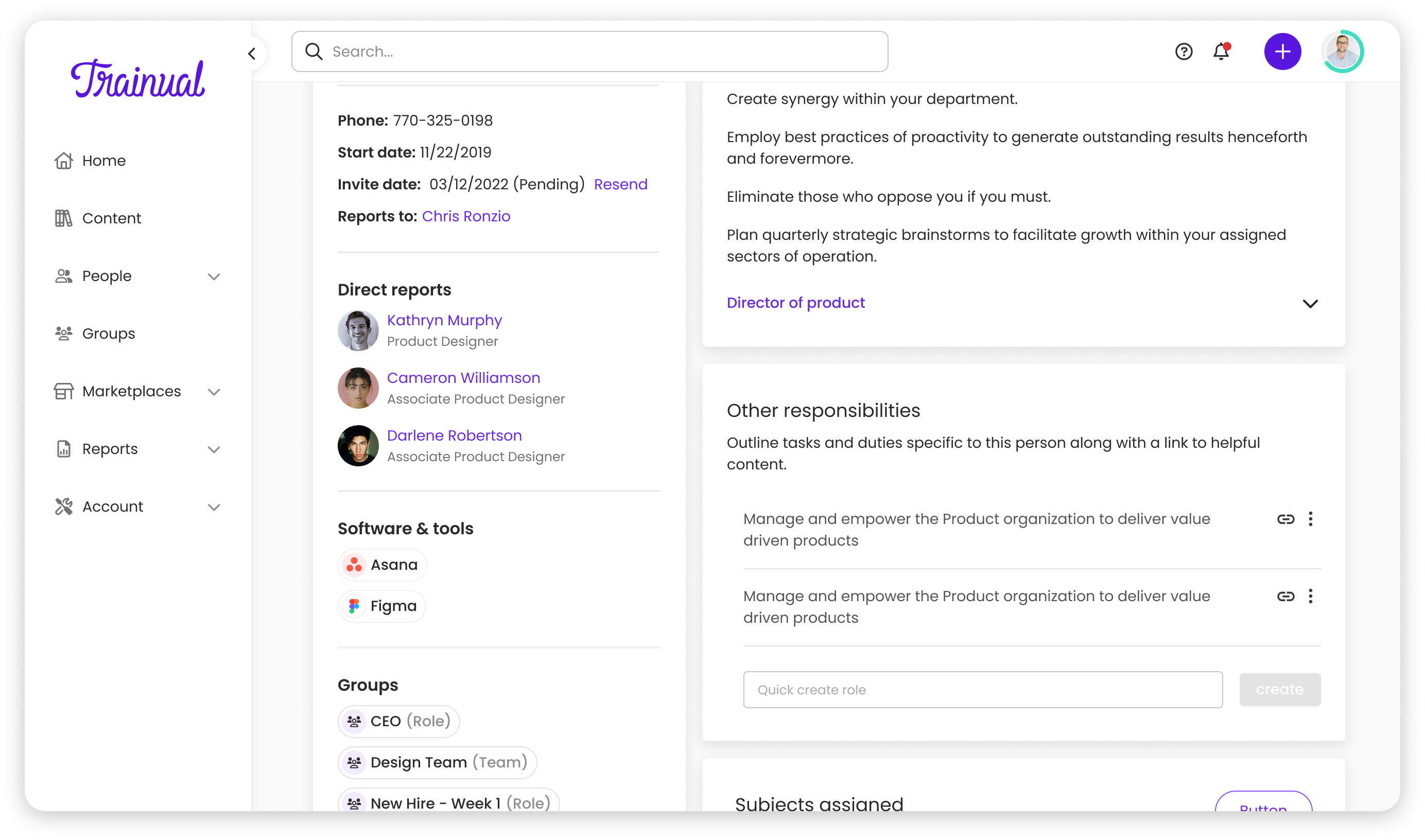
- User profiles: Show tools a person uses, with ownership badges for tools they manage
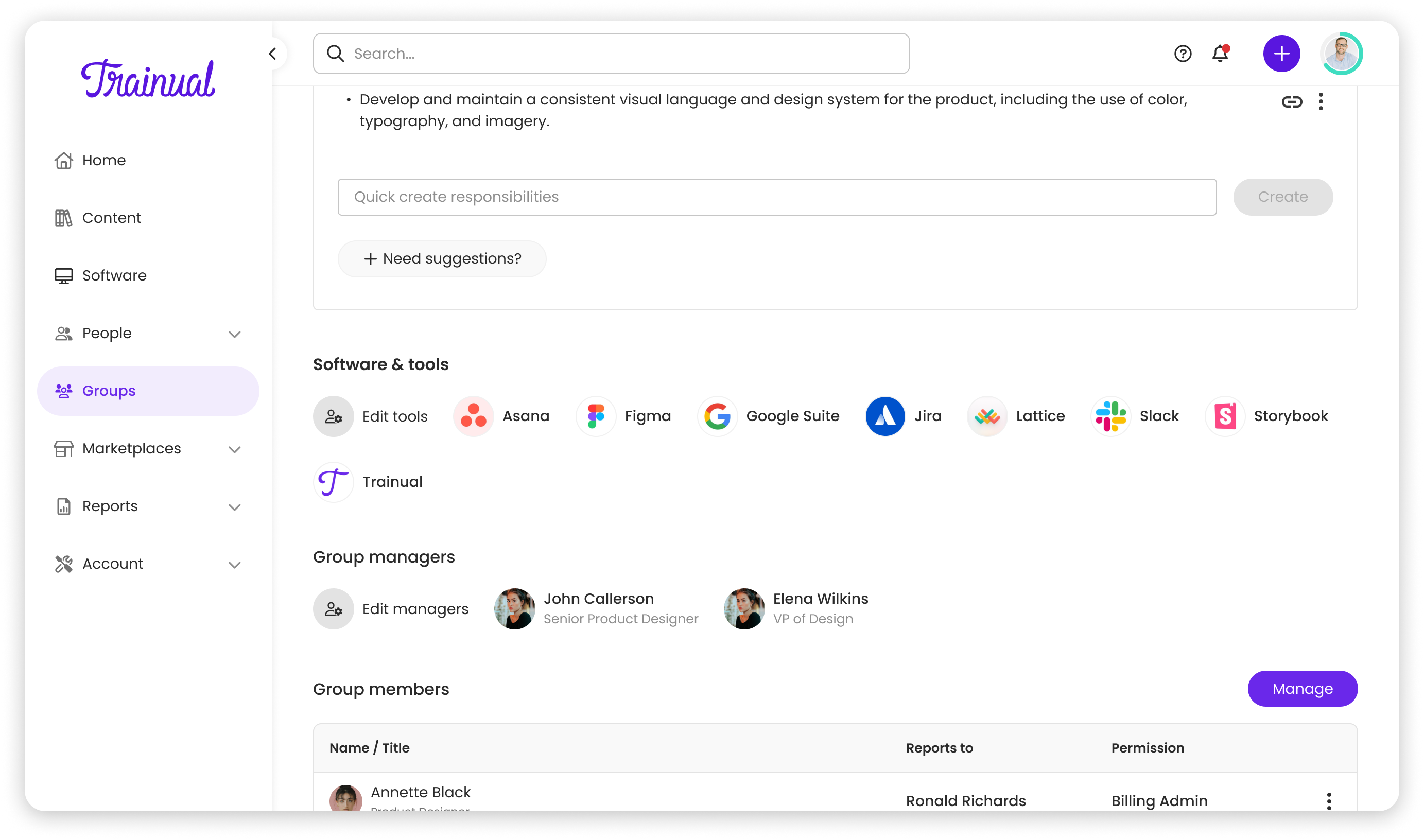
- Groups pages: Display tools linked to each group, with the ability to add more
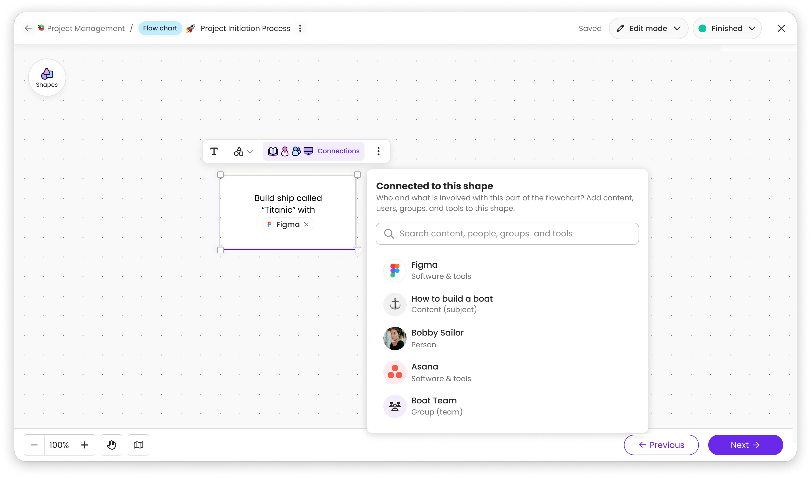
- Flowcharts: Reference tools in training and process flows
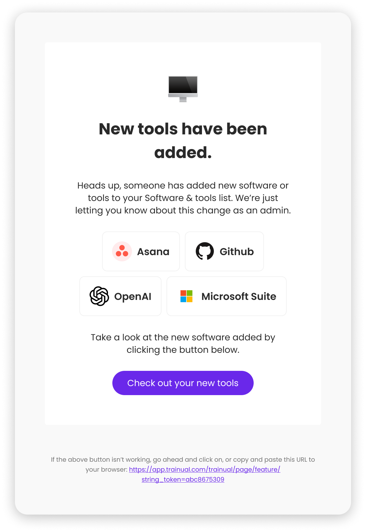
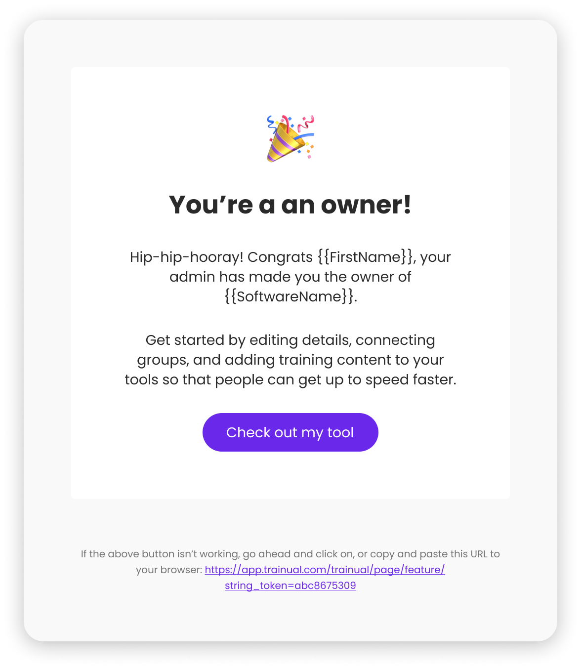
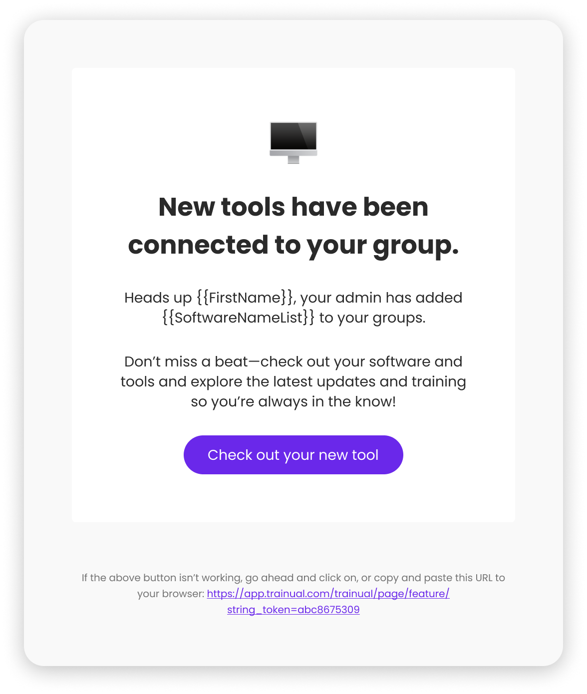
- Notifications & Action Center: Alert users when tools are added, updated, or assigned
- Navigation: Add Software & Tools as a top-level section alongside Content and People
I mapped these dependencies early in FigJam, creating a shared source of truth for the team. This prevented us from building something that felt bolted on.
Smart Visibility & Driving Usage
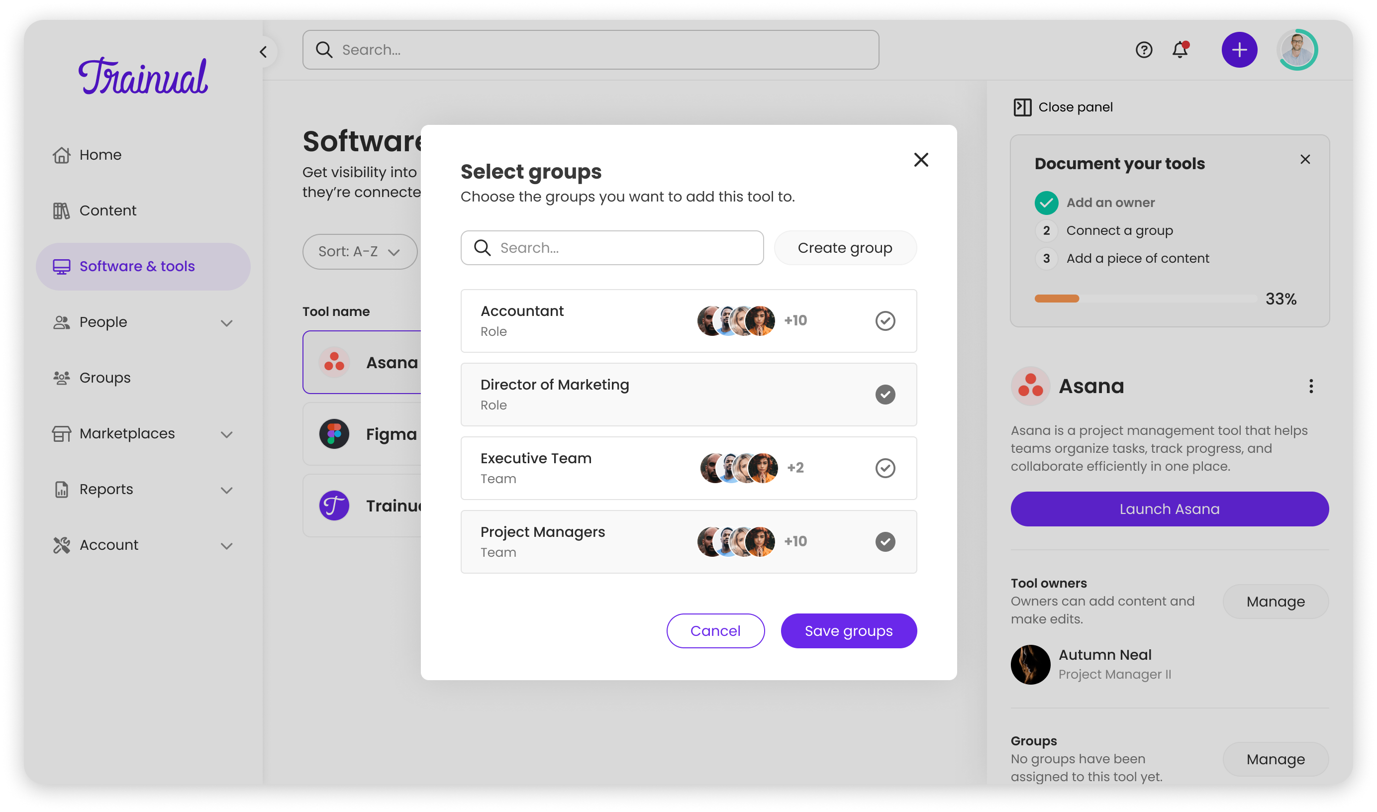
Not everyone should see every tool, so I designed a group-based visibility system:
- Tools linked to groups and individual users
- Users only saw tools relevant to them (based on group membership)
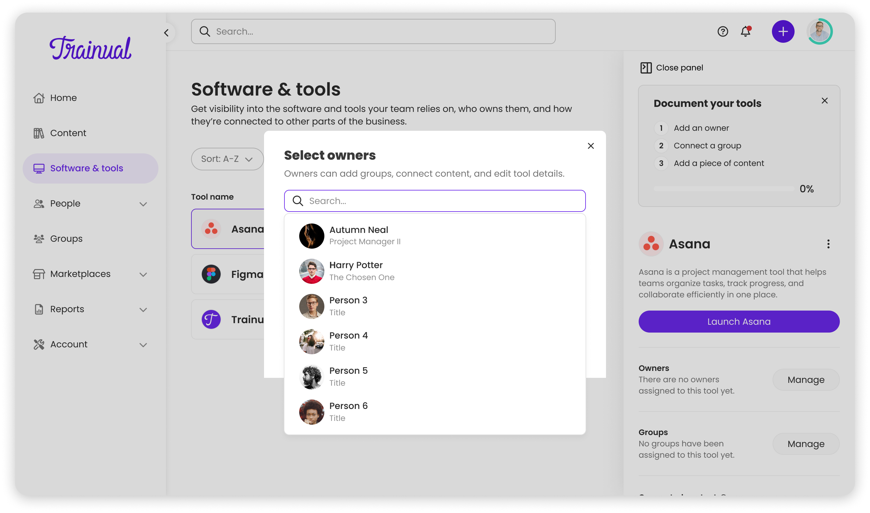
- Multiple owners could be assigned (always individuals, never groups)
- Ownership clearly badged on profiles
To drive daily usage beyond just a directory, I designed:
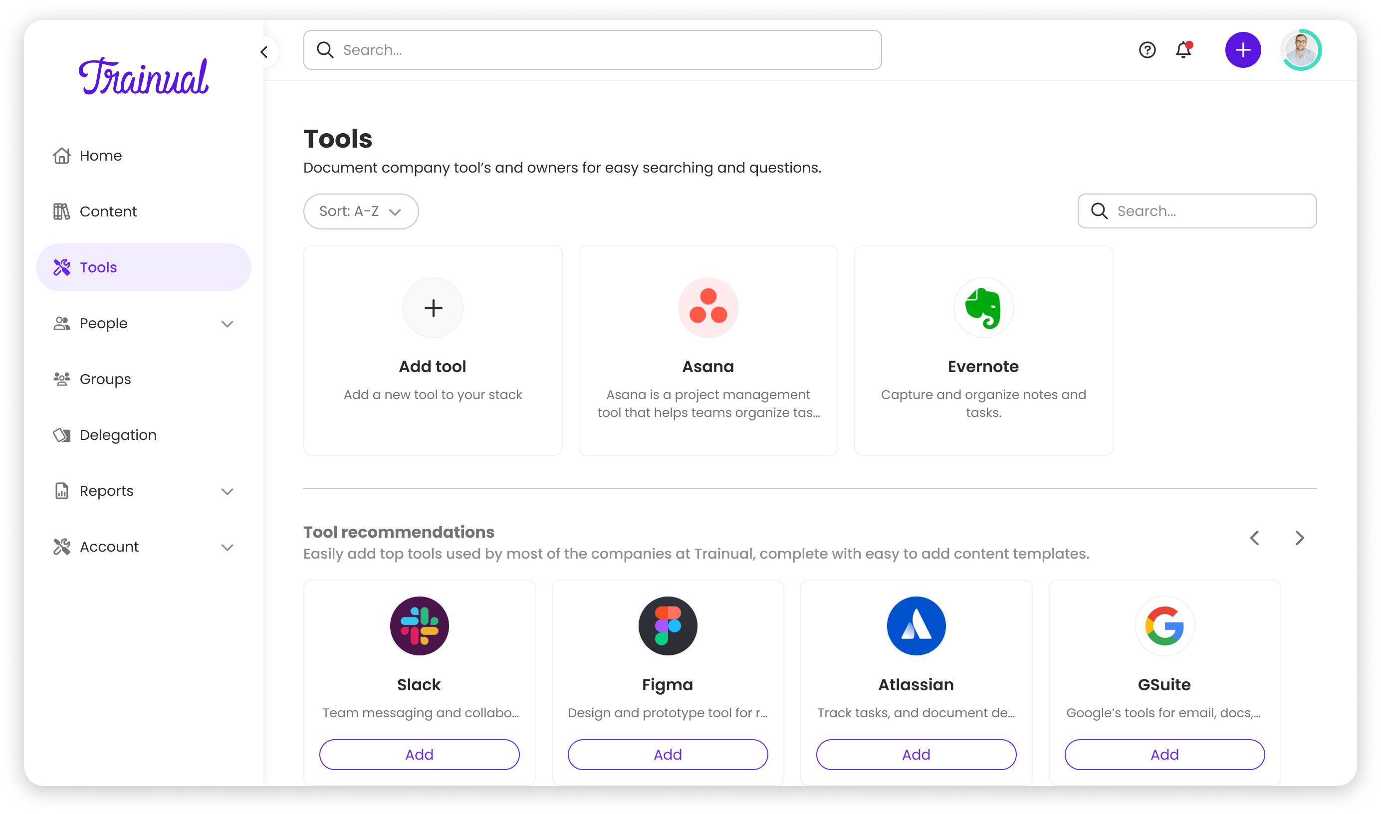
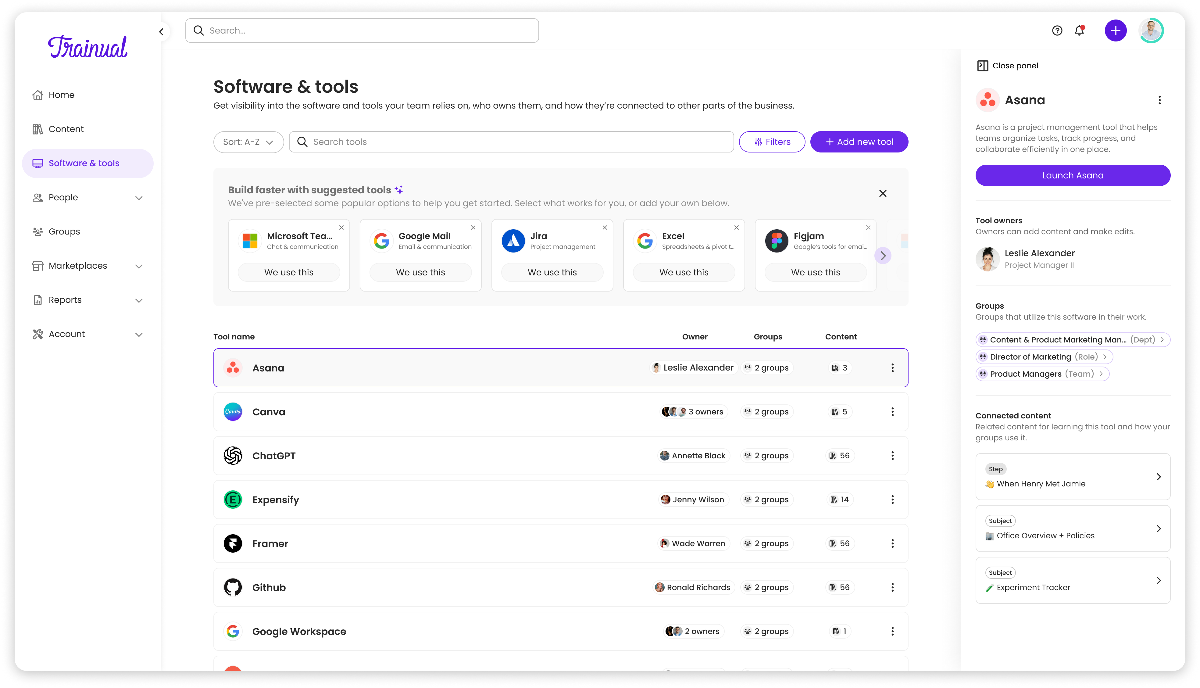
- Quick Launch: Click to open company-specific tool URLs
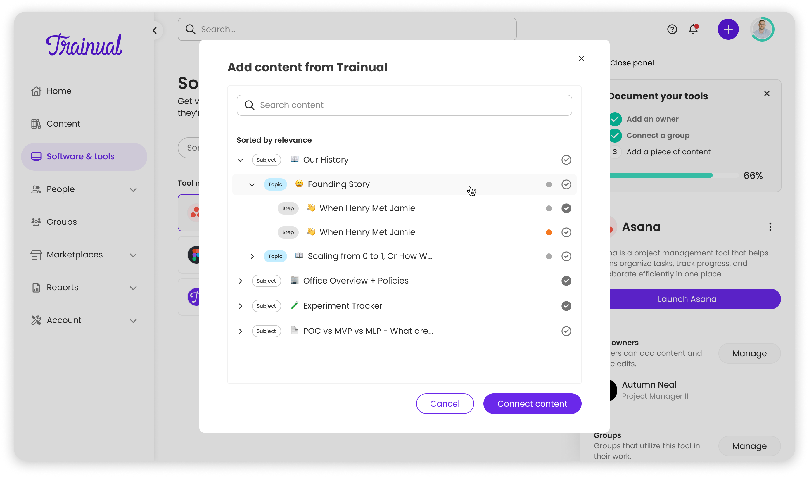
- Training Links: Connect tools to relevant onboarding docs and references
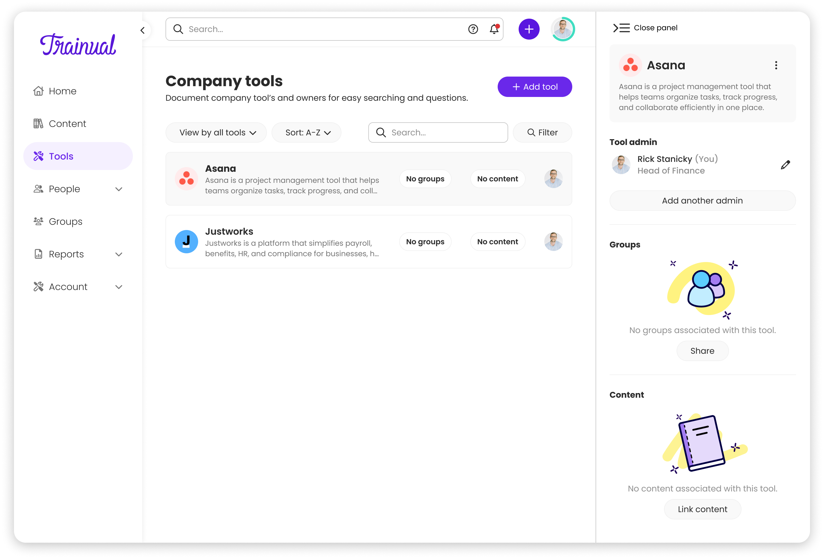
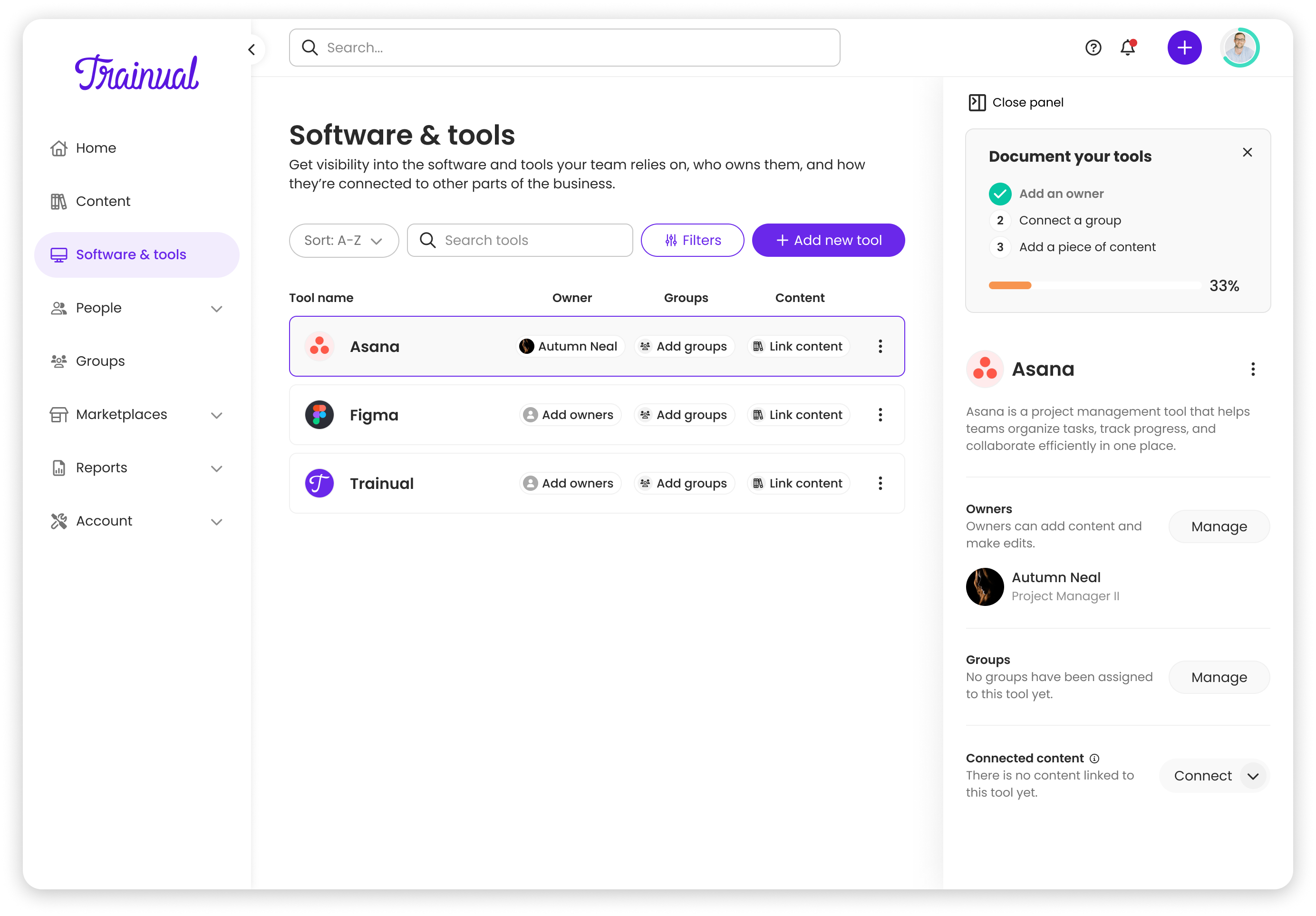
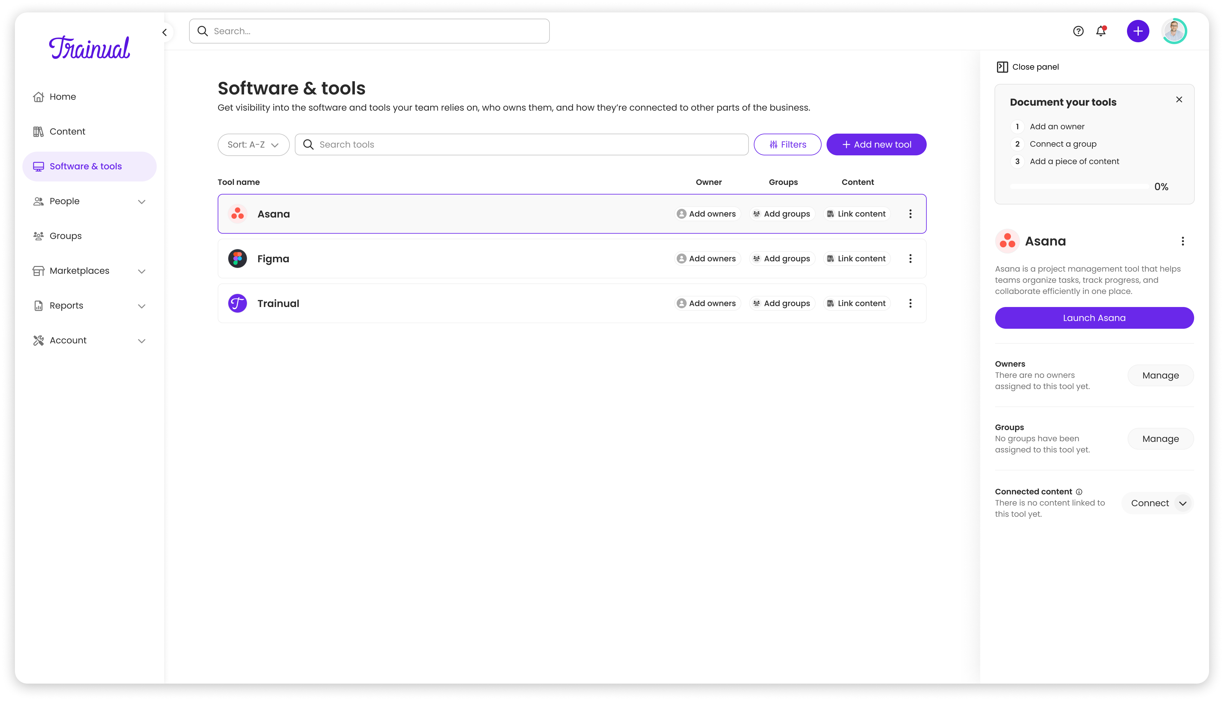
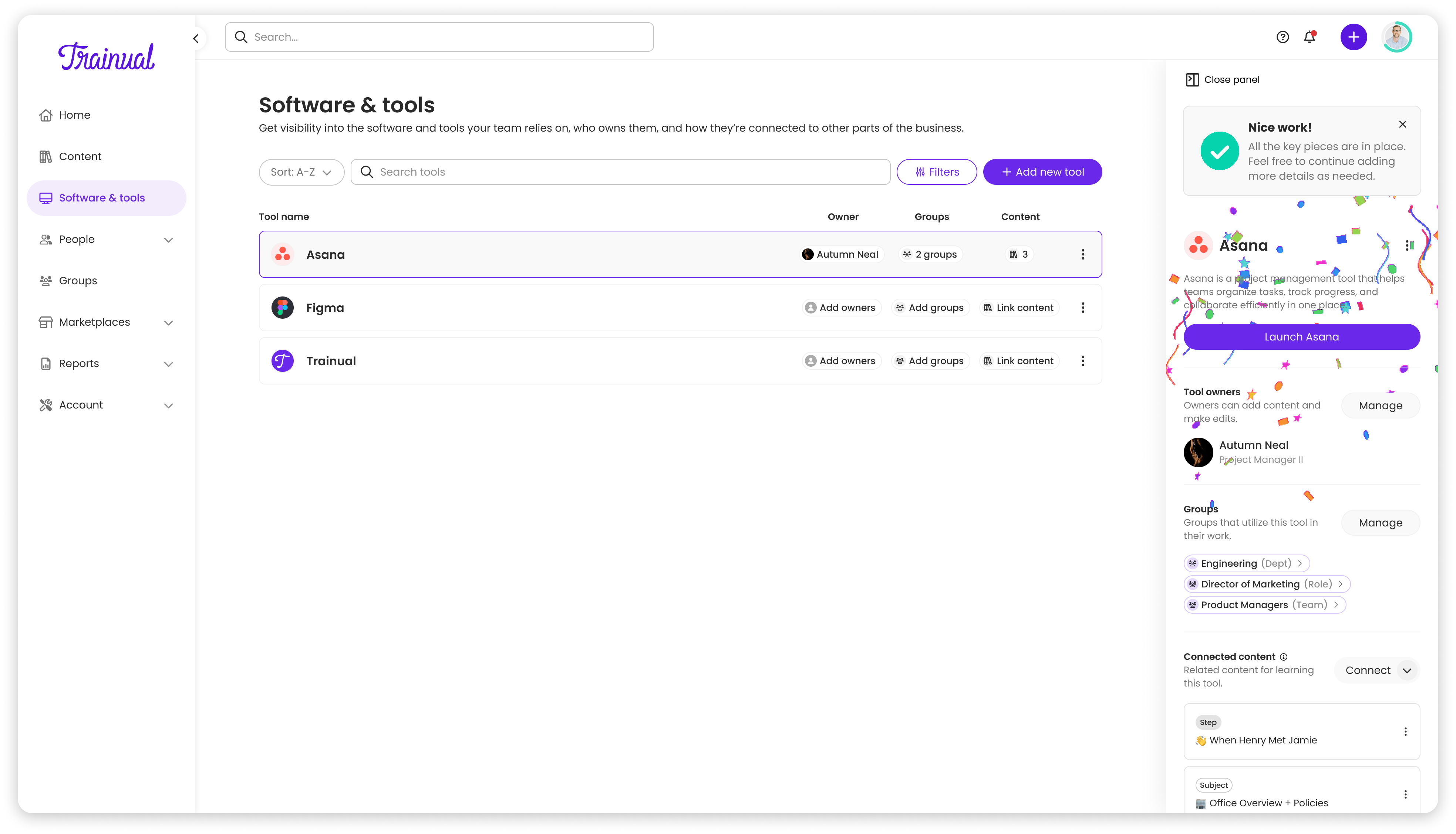
- “Populate Your Tool” Checklist: A progress indicator with 4 items (Add URL, Add Description, Add Owner, Link Content) to encourage complete profiles
Testing & Iteration
I built high-fidelity prototypes in Figma and iterated with my team throughout development. As we approached launch, I ran moderated usability sessions with customers and sent out Typeform surveys to gather broader feedback, and presented that data to stakeholders to bring them along our decision making process. Check out the stakeholder presentation here, or skip it and continue on for a tl;dr.
What I learned:
- Users appreciated the row layout’s clarity
- Quick launch was highly valued
- Some interactions felt buried, editing and replacing tools was hidden in dropdown menus
- Positioning on global navigation was not obvious
- Naming of Software & tools was vague
Based on this feedback, there were some quick wins we could make. We added in-line hover states for editing tools, making actions more discoverable without cluttering the interface. We tweaked copy and added clarity throughout the feature, reducing confusion and first time use questions.
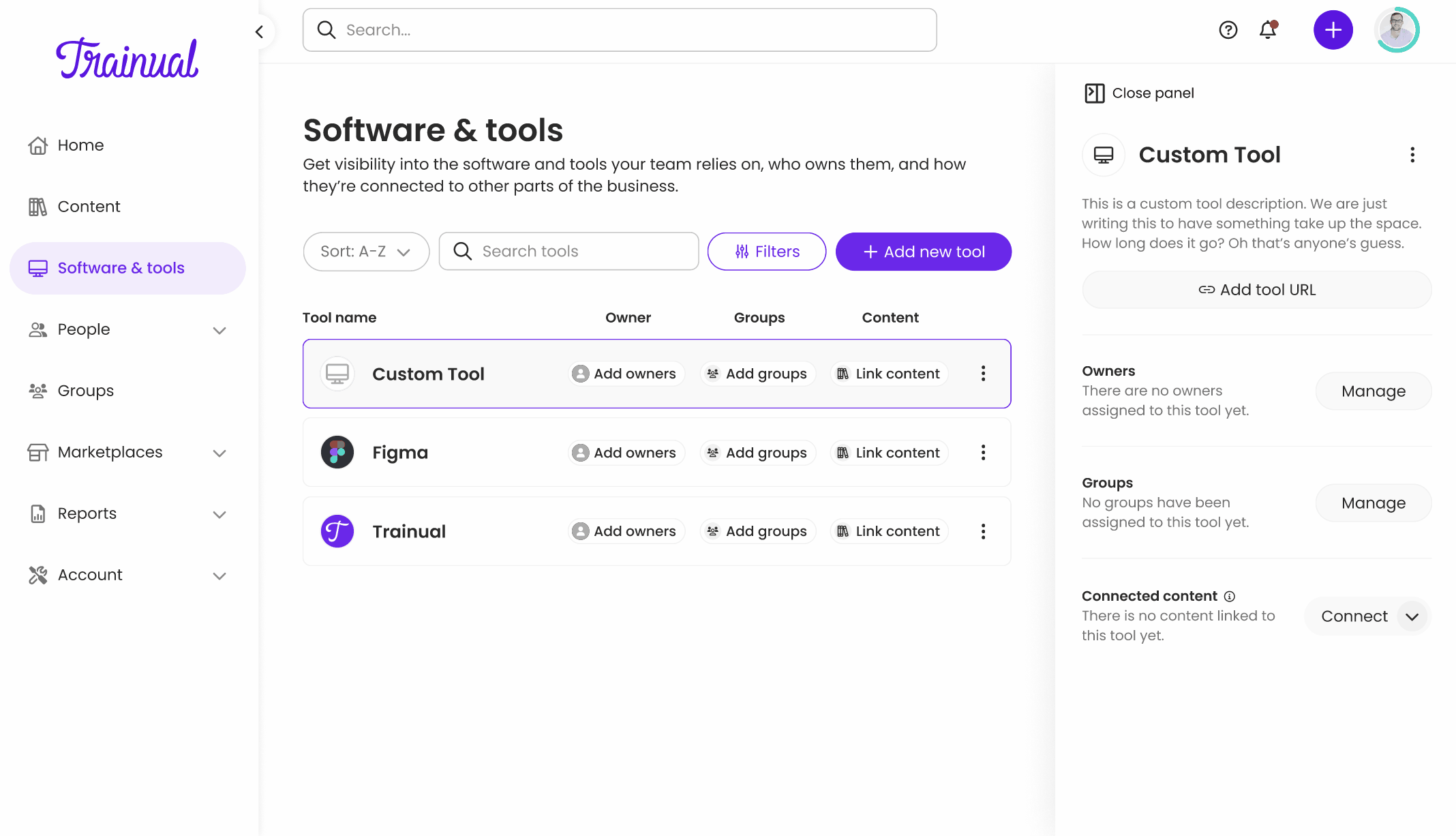
Final Product
After 3 months, we launched Software & Tools with a row-based layout that surfaced critical information, smart visibility that kept interfaces focused, quick launch that drove daily usage, and seamless integration across the Trainual platform. Take a look below to find some of the key screens from the feature.
Results
Software & Tools launched successfully and became one of Trainual’s most-used features, delivering both immediate user value and long-term strategic insights.
Adoption & Usage
- Launched to 150,000+ users across 10,000+ customers
- Broad adoption with most teams documenting at least 2 tools
- 7,000+ unique software entries created (not duplicates, real tools customers actually use)
- Trainual was consistently the first tool added, establishing the feature as a central hub
Strategic Business Impact
Data-driven product decisions: Analysis of the 7,000+ tools revealed that Slack and Microsoft Teams were far more prevalent than anticipated. This directly informed Trainual’s decision to prioritize building native integrations for both platforms, transforming integration planning from guesswork into data-driven strategy.
Competitive positioning: Software & Tools strengthened Trainual’s position as a business operations suite, building on our delegation and responsibilities capabilities. This became a key differentiator in sales conversations and customer success touchpoints, addressing a need no competitor was solving.
Increased customer retention: When customers centralized their software documentation in Trainual, linked it to training, and used it daily to launch tools, the switching cost increased significantly. Their entire operational stack lived in one place.
Key Learnings
Advocate with evidence: Challenging the CEO’s tile layout worked because I came with user research and prototypes, not just opinions. The data made the decision clear and eliminated pushback.
Think in systems: Mapping how Software & Tools would integrate across Trainual prevented it from feeling tacked on. Every new entity type has cascading implications—plan for them early.
Ship, then iterate: The panel UI wasn’t perfect, but it was good enough to launch. Post-launch refinements like hover states came from real user feedback, not speculation.
Document everything: Working fully remote with a team across timezones forced clear documentation and thorough specs, which ultimately made the product better.
What I’d Do Differently
I prioritized matching the CEO’s expectations for a lightweight MVP while exploring deeper detail views. When I presented mockups that included future features like billing reports and seat usage warnings, stakeholders pushed back to reduce scope and ship faster.
Looking back, I would have framed the dedicated page differently—not as “more features” but as “room to grow.” I should have shown how the panel would constrain us later, using mockups of future features crammed into the limited space. This would have made the tradeoff more tangible.
Instead, we shipped the panel UI, which worked for MVP but now limits our ability to add billing, seat usage, and spend tracking without a redesign. I learned that designing for “MVP + 1” is often worth the upfront investment—especially when stakeholders are already aligned on future direction.
That said, shipping quickly meant we validated the concept with real users and learned what actually mattered. The hover states improvement, for example, came directly from watching users struggle with dropdowns. Sometimes fast feedback beats perfect foresight.
Product Development Partners
- Product Manager – Dani Delozier
- Engineering Lead – Ruslan Oliinyk
 Dayne Petera