Summary
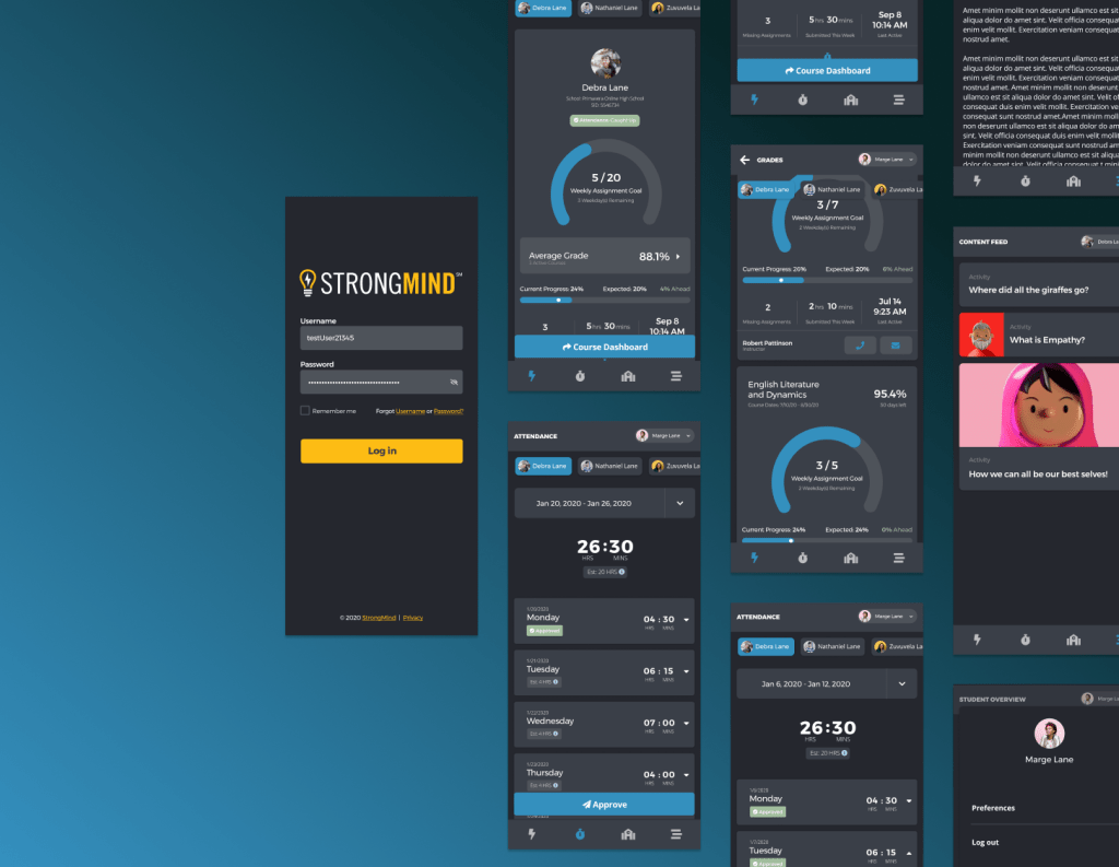
The StrongMind App is an iOS and Android application built for StrongMind, an Edtech company located in Chandler, AZ that supports charter schools around the country. The application uses the Ionic framework, and currently consists of a Student Overview, Attendance, Content Feed, and School section. The StrongMind app was created to allow users to access core information and useful content, while on their mobile device.
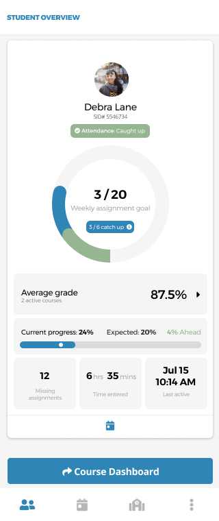
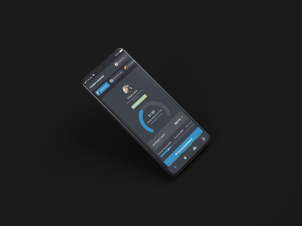
StrongMind App – Student Overview
Making sure information is relevant without being overwhelming.
Role
UX / UI Designer
Ideation, UX, Prototyping, UI, Front-end
Project Duration
2 Months
July 2020 – September 2020
Company
StrongMind
In-house
About this Project
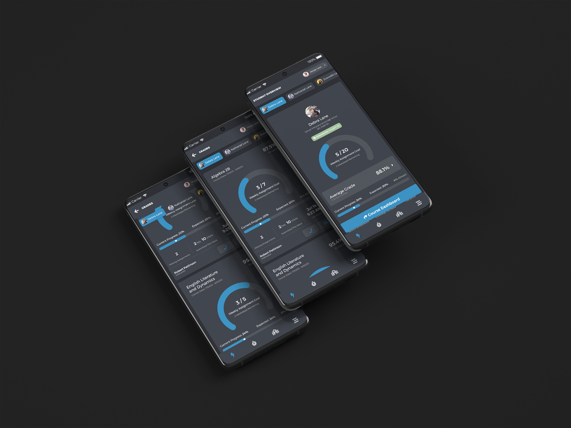
This project was the next main feature on the application that I had been leading since February. The next large undertaking was to include a Student Overview section that could offer more insight and information to the users that used our other systems. The goal was to provide valuable information to both students and parents that was digestible, actionable, and could lead to good conversations.
Working with my team and our UX researcher we were able to acknowledge early issues, iterate on the design and feature set, and get feedback that shaped the ultimate solution for this problem. We ended up with features that were meaningful to both parents and students and met the overall needs of the business while displaying the information in a visually appealing way.
The Challenge
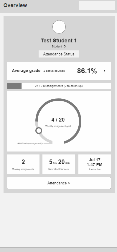
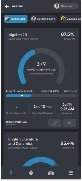
So far the application had only consisted of 2 pretty basic sections, Attendance, which houses submitted attendance for students to be approved by parents. As well as the School page; which was a different version of an iFramed website depending on client. The next feature that was expected was something much more data and information rich with new patterns that hadn’t yet been established for the app. Dubbed the Student Overview, it was akin to a parent student portal and needed to do a few things from a high level:
- Feature needed to be simple enough for 6th graders to understand
- There needed to be actionable information based on business requirements
- There needed to be a circle graph in it (request by the CEO)
- Feature needed to make sense from both a parent and student perspective
- Feature needed to be modular (agnostic so each client can use it without some features)
All of this information needs to fit in a hierarchically meaningful way while being approachable, digestible, and concise.
The Solution
First we started with AC to make sure that my sketches and wireframes included everything that was listed out from a business perspective –
- Course progress page should primarily use Learning Management System (LMS) data, to make it more Student Information System (SIS) agnostic
- Course progress page should be built in a modular way
- To not include certain info if not available from the school
- This first iteration will only include information for student(s) current courses
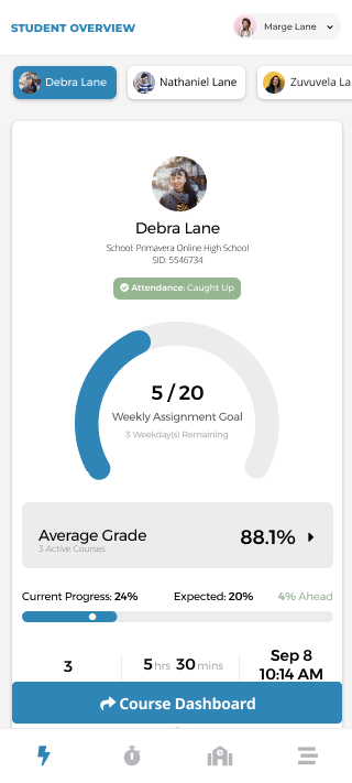
- Student Level (overall) summary
- Last activity date/time – across all current courses
- Average Grade
- Straight Avg Progress Grade across courses
- Missing Assignments
- Progress – Current Week: % actually completed vs. % should have completed
- Progress – For term: % actually completed vs. % should have completed
- N2H: Estimated # of days behind
- N2H: Grade Trend
- N2H: Average # of assignments / day
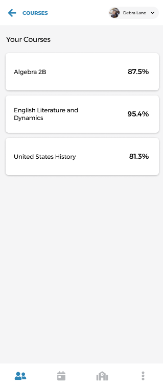
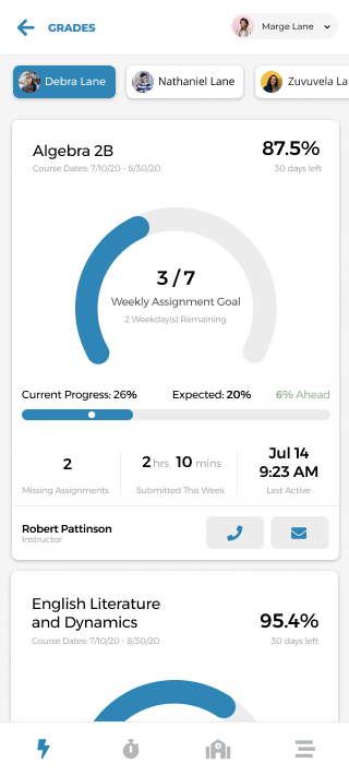
- Course Level Summary
- All above points broken down by course
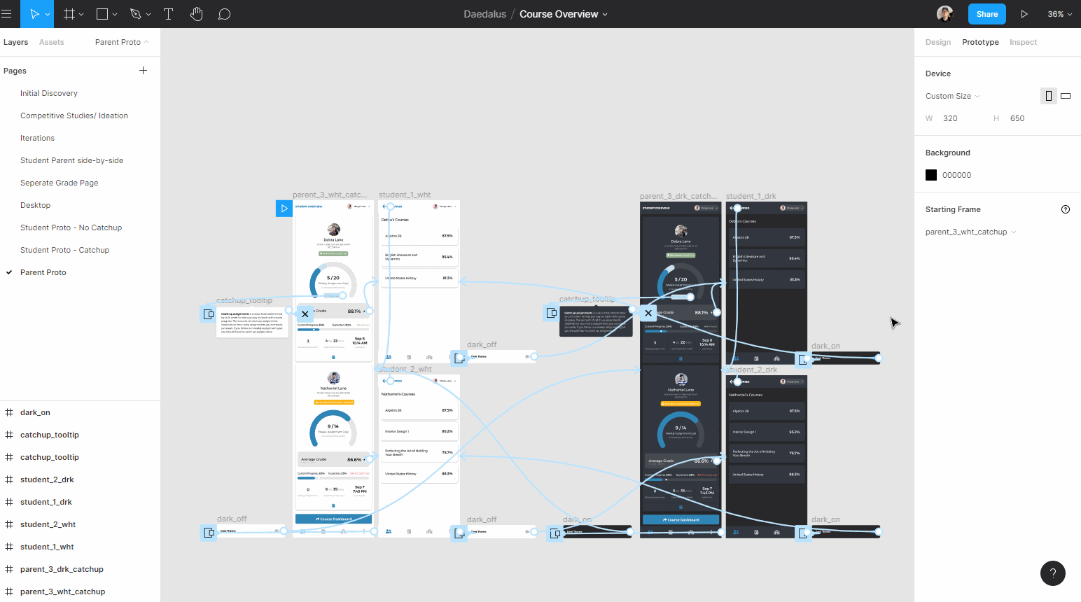
We came up with the above criteria based on studies run during the initial pilots for another product I worked on, Loud Mouth. Knowing this I started to get to work discovering and defining possible pain points and how we could leverage the existing UI to develop a solution for the problem. I then moved to sketching out and wireframing possible combos of the above data points. While doing this I checked other products within StrongMind to see if patterns already existed that I could utilize for the problem at hand.
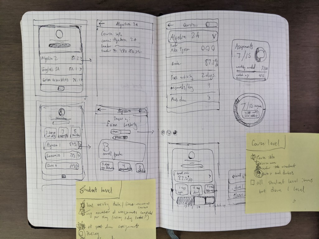
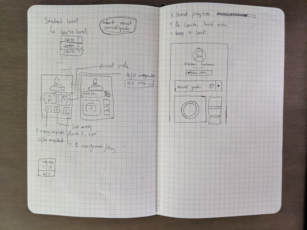
After I felt like I had the initial layout and hierarchy established, I moved on to wireframes and conversations. I made sure to consult with the developers as well to make sure we could get the information we needed, in the way we needed it. I then went with an Axure wireframe to further layout the design and data elements. After this I tested the wireframes/ low-fi prototype with a coworker that happened to be the parent of a student that attended one of our client schools. I went this Guerilla Testing approach to get a quick gut check on my first solid iteration of the design and see if hierarchy and the overall UX was good before working with our company UX Researcher.
Working with Matt we came up with some high level questions we felt needed validation before moving on. We tested the prototype with 8 users; 4 students and 4 parents.
- What progress elements do users expect and value most?
- Will users understand the data as it is presented? What does it motivate them to do?
- Can users navigate to the individual course progress screen and back?


Results
- 🙂 Users clicked the Average Grade box to show them the course breakdown and successfully navigated there
- 💡 Users found information on the Courses screen to be more helpful, but they understood and could appreciate the overview
- 💡 Students and parents alike rated Missing Assignments and Average Grade as most important to them
- 😡 All users were confused by the concept of catch-up assignments and most believed them to be the same as missing assignments
- 😡 Most users struggled to comprehend the weekly assignment goal graphic
- 🙂 However, most students highly appreciated the weekly goal concept because they like keeping track of weekly progress and many already did so through their own means
- 🙂 All users greatly appreciated the ability to contact the teacher, and most wanted the ability to message the teacher directly through the app
- 🙂 All users agreed they would use this app – with students claiming daily use – to check on their grades or progress, specifically noting ease of use on mobile
- 💡 Users responded most positively to elements that were either immediately actionable or aided in their weekly progress
“It implemented some things that I wish the StrongMind course player had. So it’s definitely a step up from there. And it’s all on your phone”
– Student | 12th Grade
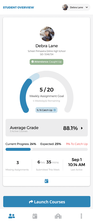
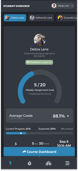
With these results, I got to work on revising the designs and starting to establish some visual design choices as well. The StrongMind app already had a palette established as well as some card ui items so I was able to throw something together quickly that accurately portrayed the work done during the wireframing step of my process. This is definitely my longest process as I like to go down a lot of different avenues to explore different design decisions. I find that getting all ideas out helps to refine the best of what comes out.
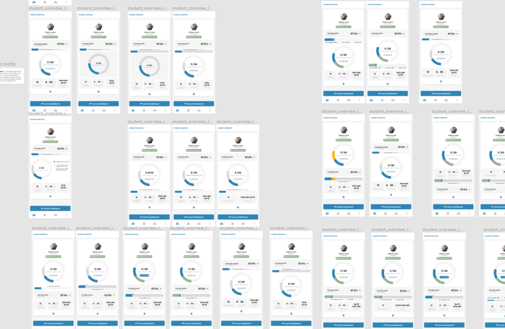
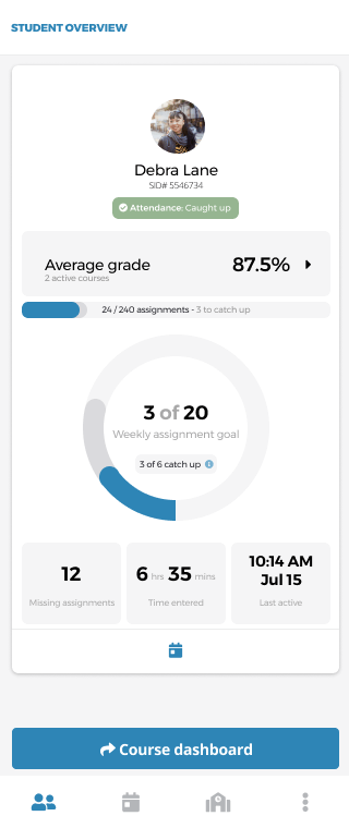


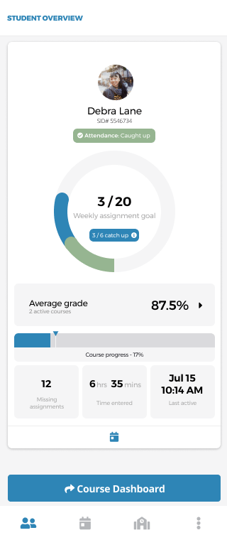
After refining the design a bit more and going through a few iterations with my Product Manager as well as other designers within the org, I landed on this design.

And since I’ve done everything in Figma, it’s very simple for me to hook up a prototype. Once the prototype was ready, it was time to run our follow up testing session. Working with Matt once again we came up with a test plan that was very similar to the previous one. We were asking the following questions this time around with 7 participants, 4 returning and 3 new users –
- How do users interpret the UI? And the information?
- What are users’ impressions of each element’s usefulness?
- How does this change from the previous tests?
Results
- 😡 Even with higher fidelity design, the catch up assignments concept was still inconsistent at best.
- Users were often confused between catch-up assignments, missing assignments, and how it related to the overall progress.
- 🙂 Users appreciated the hierarchy in this new design more than the old.prototype
- 🙂 The weekly progress circle UI was more easily understood
- 🙂 Attendance Status was very well understood
- 😡 Some UI elements too vague to spur very meaningful action
- 💡 Users rated missing assignments as the largest contributor to their perception of how a student is doing in school, as well as the most actionable data point
Features
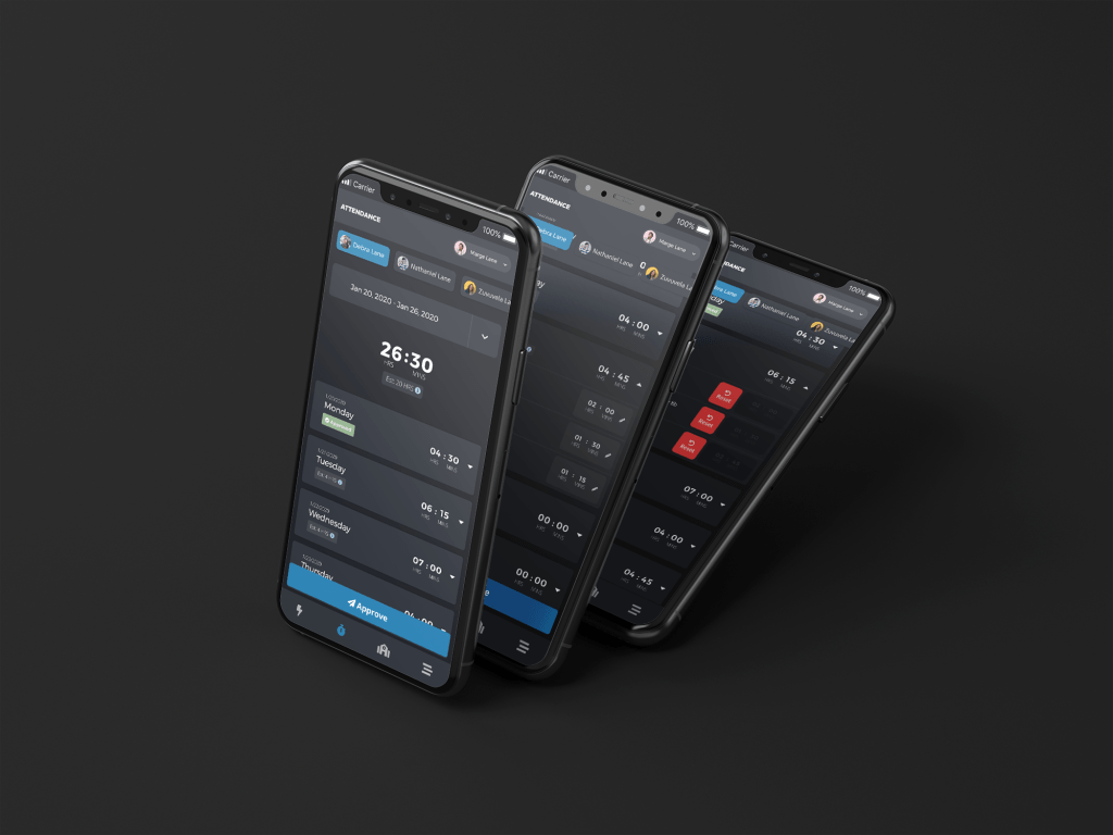
- Attendance Status
- Ease of Understanding: 4.9/5
- Weekly Assignment Goal
- Ease of Understanding: 3.5/5
- Catch Up
- Ease of Understanding: 3/5
- Average Grade
- Ease of Understanding: 5/5
- Progress Bar
- Ease of Understanding: 4.3/5
Overall System
- Information
- 3.7 / 5
- Language
- 3.9 / 5
- Layout
- 5 / 5
Reflection
Overall this was a large feature that was completed in a relatively short matter of time with multiple rounds of testing. I am proud of the speed and amount of collaboration that happened because of this feature. I’m also happy about the information we learned, how it can help the company in the future, and discovering a solid direction to walk towards. I learned that things that seem simple to some are oftentimes misunderstood by others and that users generally tend to want to dive more deeply into specifics on data.
Next Steps
- Help development teams implement front-end elements and maintain consistency.
- Implement design changes based on usability sessions.
- Work on the desktop version of the application that will be coming soon.
- Check in with users after a month or two of use (run another usability session with returning and live users + survey)
- How do perceptions of the elements change in-context, with actual data?
- Is the overview an influence in the way students keep on top of their work?
- What would increase its effectiveness?
- How does the overview affect the student – parent relationships? What differences will develop between their understanding of elements?
- Does it live up to the expectations of users who already tested the app?
Utilizing the recommendations and learnings of this first implemented iteration I went back to my designs. For one, to make sure to include the course level data that was not represented in the last usability sessions. Two, to change around some design elements / excise them completely. This part of the AC was changed prior to testing to account for a more realistic development effort in a short time with resources available. The plan was to iterate to the next version below.


 Dayne Petera