I was fortunate enough to lead the UX side of a brand new product within Pearson’s K-12 learning software, Scout. Teachers could not find any sort of observational assessment application that met their needs. So Pearson decided this would be a good time to lead the charge and create something that teachers could use well. Thus the idea of Scout was born. One of our largest product teams came to the UXMen with a problem.
- Teachers needed a way to observe and assess their students based off the content given to them. These teachers need to have a centralized location where all of their observations can be kept and referenced for any occasion.
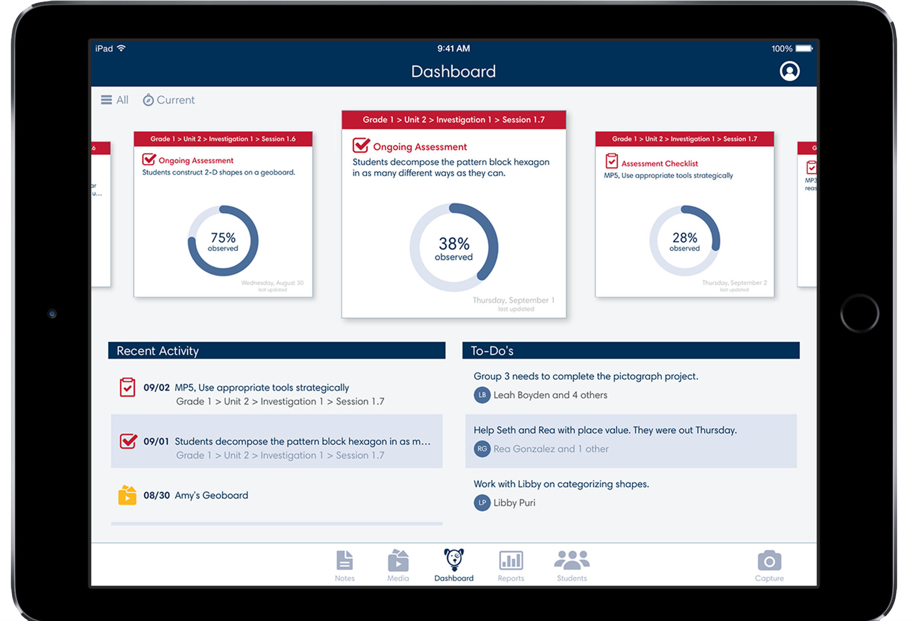
Scout is a wonderful tool that allows teachers to very quickly at a glance do multiple important actions within a classroom. Some of these actions include:
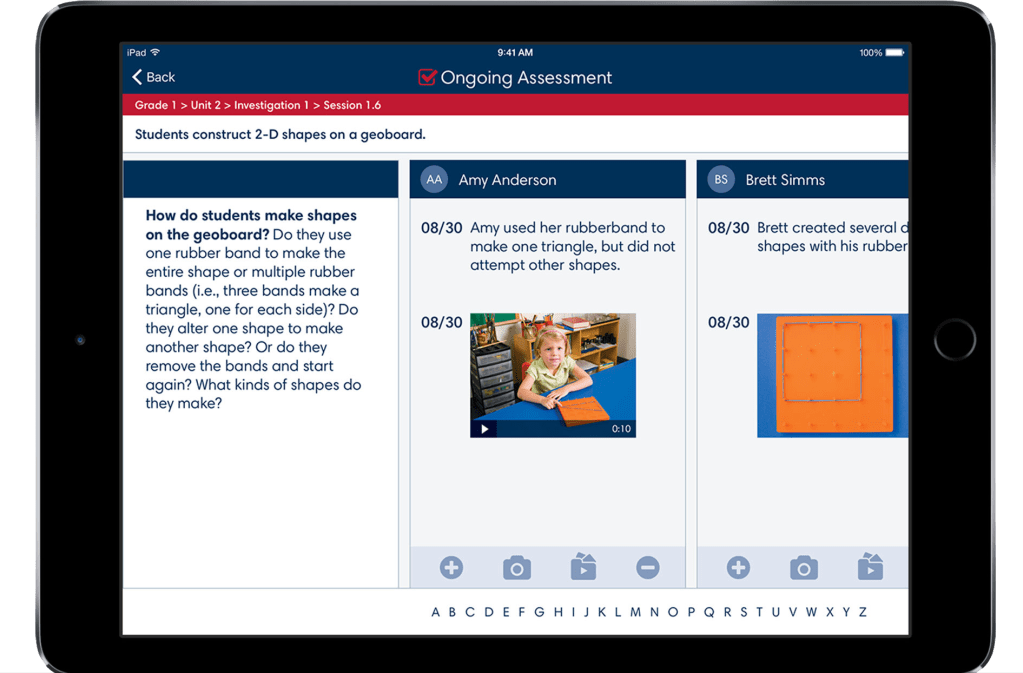
- Being able to observe and report on the student and how they are progressing.
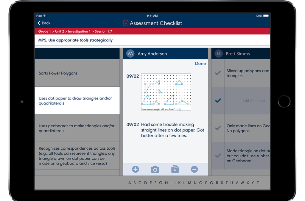
- Making sure the student is meeting criteria and standards set forth based off their content.
- Associating media and data with students to reference for their own records as well as to inform parents of progress.
- Checking off observational checkpoints within a lesson relating to a particular student.
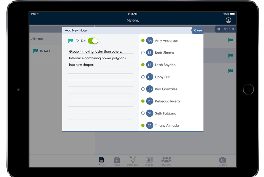
- Taking individual and group notes on students and be able to quickly access and edit those notes.
- Assigning to-dos and reminders for follow-ups with students.
- Having contact information and archivable information on students if the needs arises.
From this list here you can see that there are many things that are within this one application. That was one of the biggest problems that I faced when started to lay out some of the information architecture of this application. The question was , “How will this all work together?”. Obviously we had requirements written around what needed to be within the application but no certifiable way to go about navigating this information. So we set a priority list and did some ideation sessions on what content needed to be housed under different areas and what exactly needed to be easily accessible from a very high level standpoint. We landed on 5 options.
- Users needed to be able to access the dashboard quickly and easily.
- Users needed to be able to edit students contact and personal information if changes arose.
- Users needed to be able to make very quick changes to their notes on the students in their classroom.
- Users needed to be able to access, assign, and add information to media as easily as possible.
- Once we got to our first round of testing we realized that teachers want to be able to take images and videos of students more quickly, so we added in a capture button for ease-of-use.
- Users needed to be able to access data and reports generated from their ongoing observational assessments.
Once those categories were set we were free to design the intricacies and patterns within the application. I was able to be a champion for our users during this project and was also able to lead the UX side of this application with our users in mind and not our stakeholders. Our end product turned out very well and testing exceptionally well scoring high on all usability testing metrics.