Realize was the first professional project I worked on as a User Experience Designer. I was brought onto a team of fellow Lumberjacks to help bring the next iteration of learning software to millions of students across the country.
So what is this ‘Realize’ which you speak of?
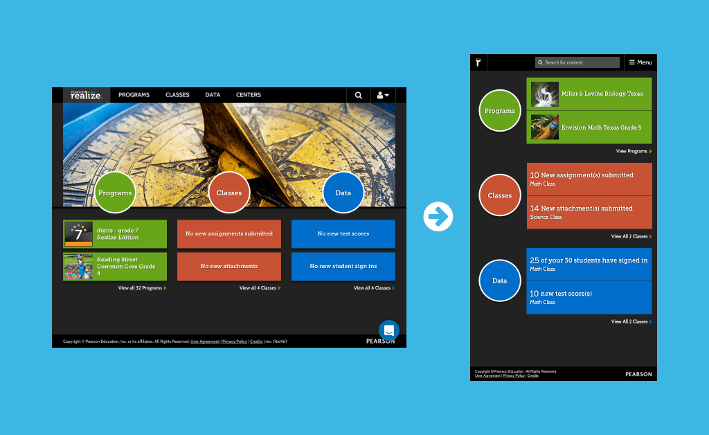
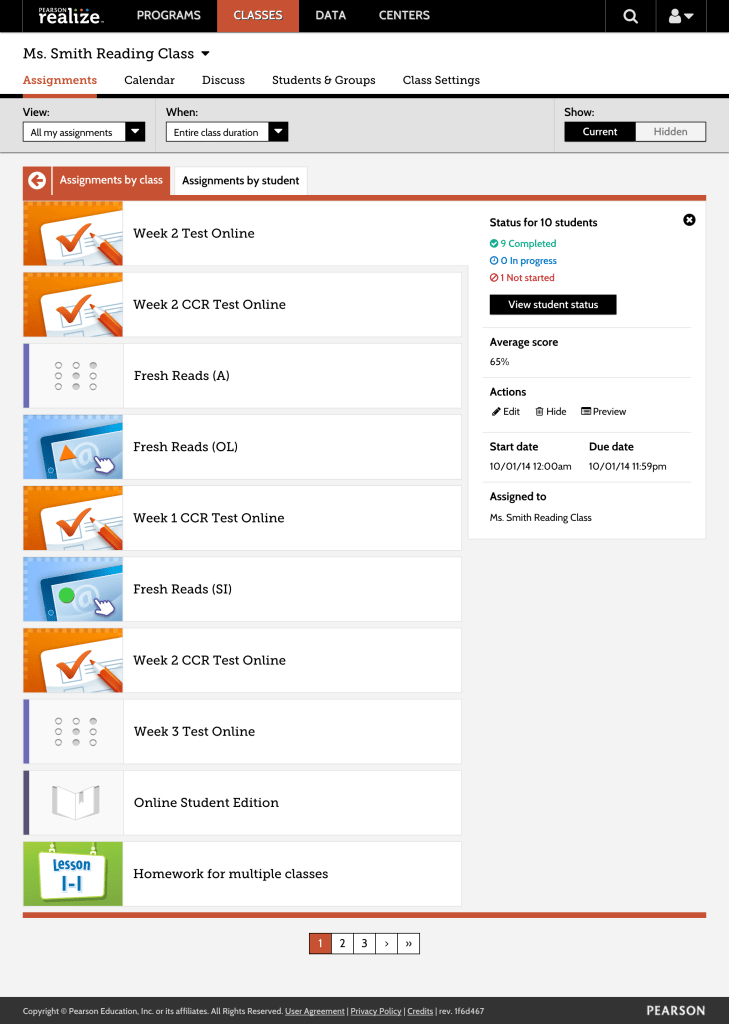
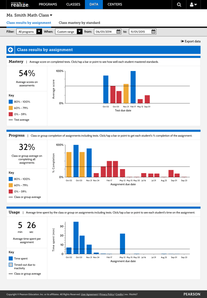
It is a K-12 Learning Platform where teachers can create classes, assign content based off what their subscription is, and keep track of their students’ performance. These main pillars of the experience are divided into three sections; Programs, Classes, and Data. Over 6.5 million students get a similar experience with the ability to complete their work, check their grades, and even browse the student-facing content their teachers are subscribed to. Each section gets its own identifying color that is consistently featured in across its following pages.

Over the course of this project I developed my skills as a UX designer, learned how to rapidly prototype our new designs using Axure and some HTML/CSS hacks, participate in and learn iteratively with frequent in-person user tests, and helped to manage the product’s style guide as well as documentation of best practices.
Realize was a challenging project to help build and together our team continues to support it moving forward.
Let’s get specific.
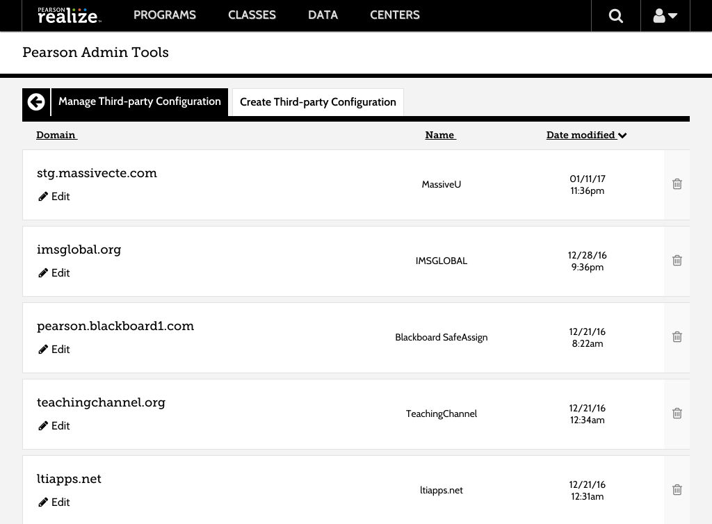
Pearson recently received their LTI Certification from IMS Global and with that they needed a way to ingest and export common cartridges that so that they can link to external content within Realize and vice versa. This feature did not exist so I had to start from the ground up with this.

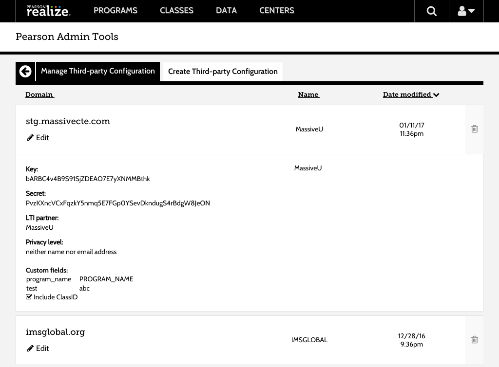
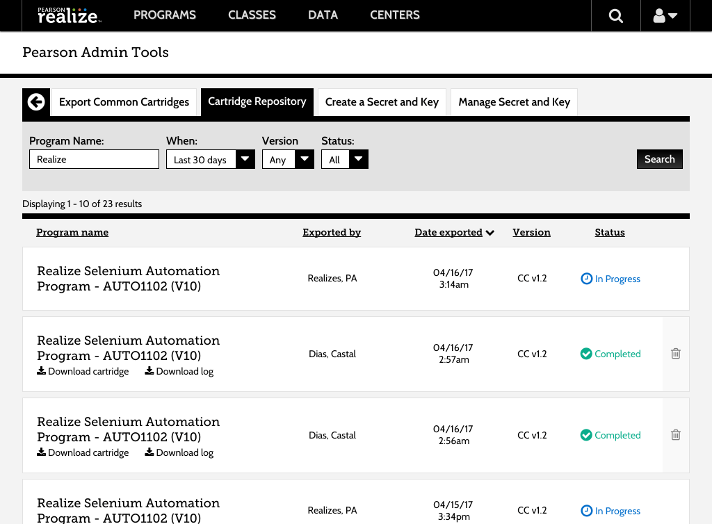
One of the largest problems faced with this was creating the field that contained all the metadata information and how we could have that be easily accessible but unobtrusive at the same time. I came up with the idea of having a clickable row with a hover state over the entire row that contained the information and could be edited within that field and saved on the turn of a dime.
It needs to be… at least half as wide as this.
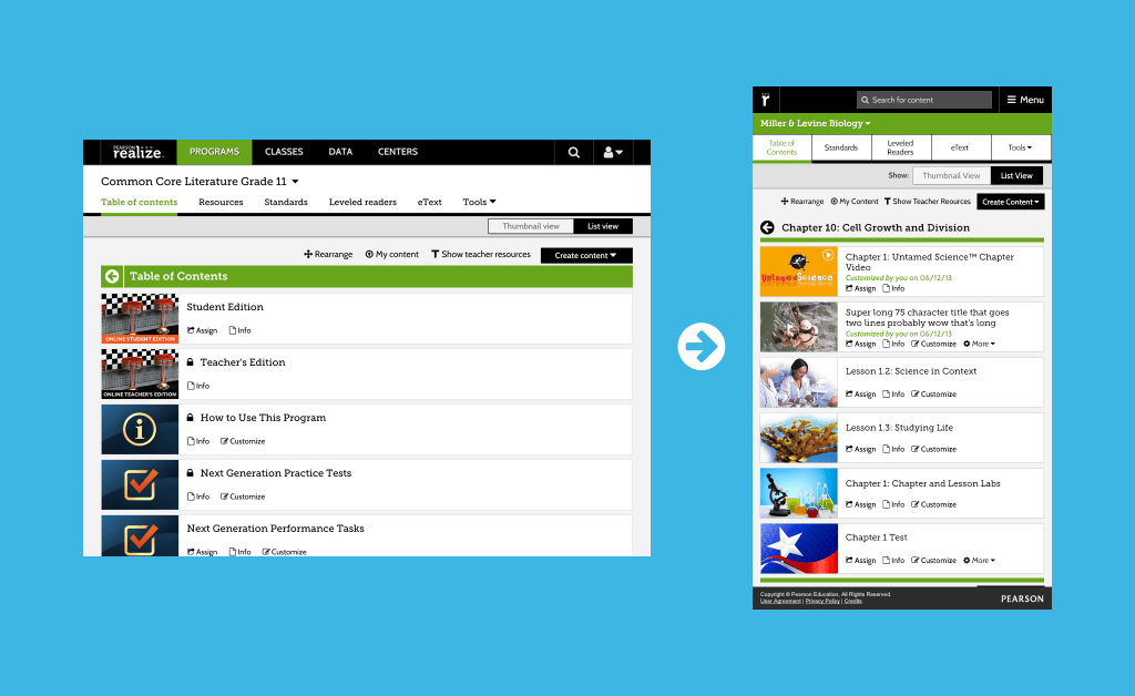
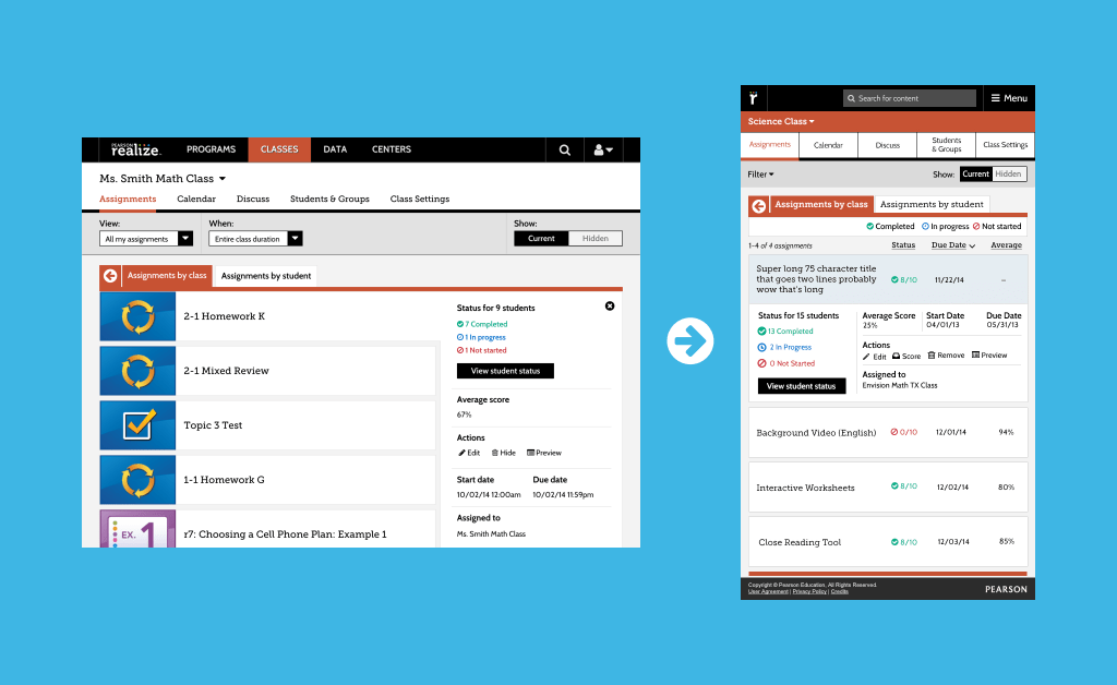
I along with another designer were tasked with making almost every screen and scenario within Realize responsive down to 540px. This was an interesting task as I was always taught to go mobile first then work larger. But since Realize was a webapp that was made for desktops and then the data came through that there was a little over 20% of our market that were using some sort of portable tablet device under 768px there needed to be a change to how the experience was being handled. Below are some of the examples of changes made.