
This style guide is the brainchild of UX Manager Alexis Bussa. The idea was to document our design patterns in a way that is useful to developers and to get us to look as badass as we actually are.

Alexis’s WordPress development experience allowed our team to collaborate on a site that looks great, is easy for our developers to browse, and easy for us to update. My major contribution involved including patterns for our default content theme within Realize Reader, our K12 icon asset retention and creation, and the documentation of usability testing sessions.
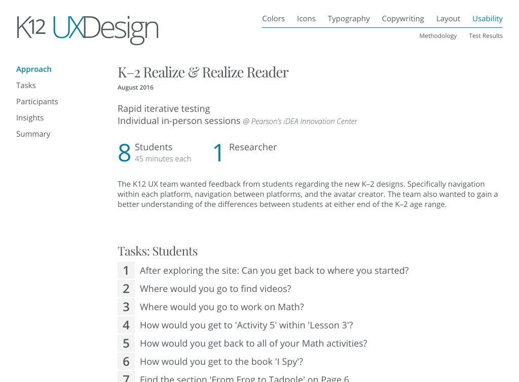

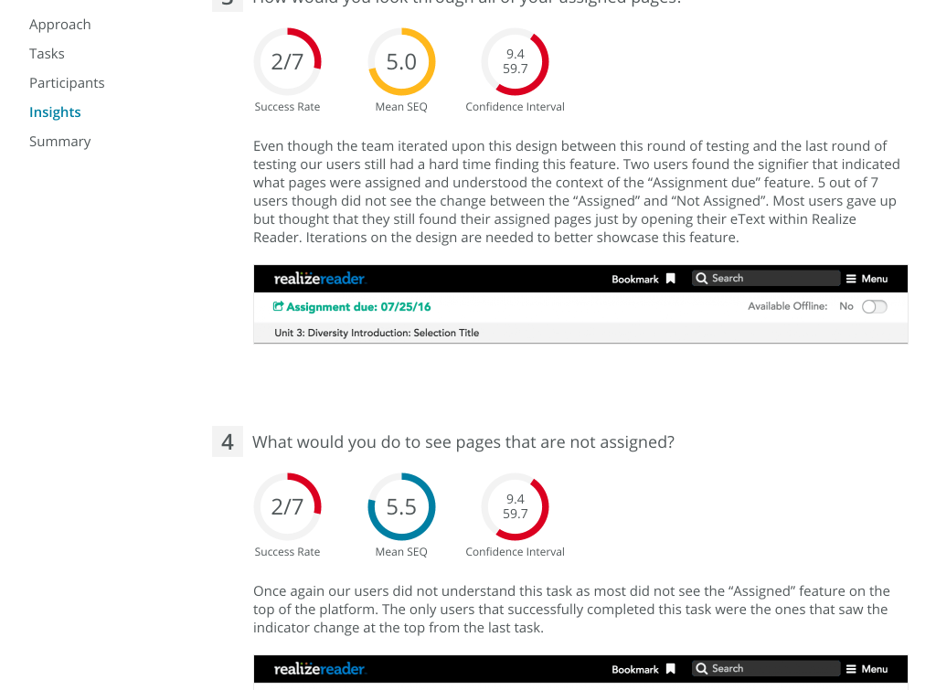
The site also is home to all our detailed usability testing results that we would then spread amongst multidisciplinary groups to better inform them of our practices and just what it is that we UX Unicorns do.
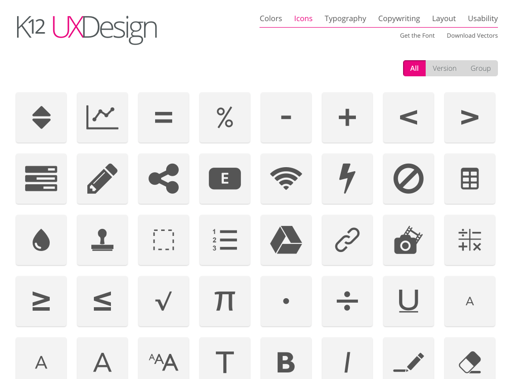
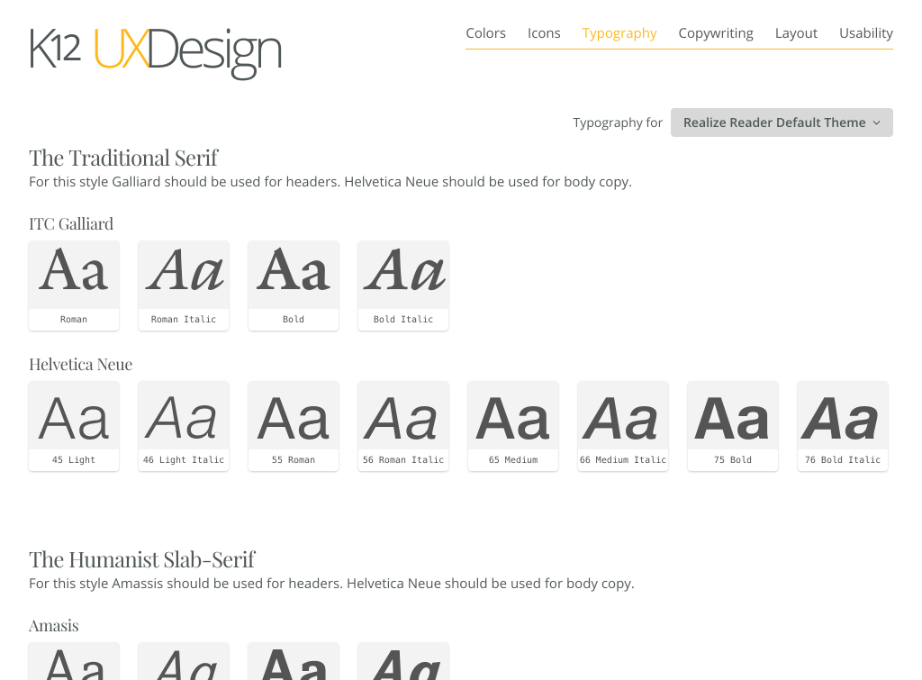

In addition, the site features documentation of colors, typography, and our own icon font that I update regularly. This site also houses our latest design deliverables that development could come to if they needed anything their heart could think of. Even though we’ve started making the jump to more efficient annotation tools like Zeplin, this style guide still serves its original purpose of housing our proven concepts that look great and keep our users happy.
